
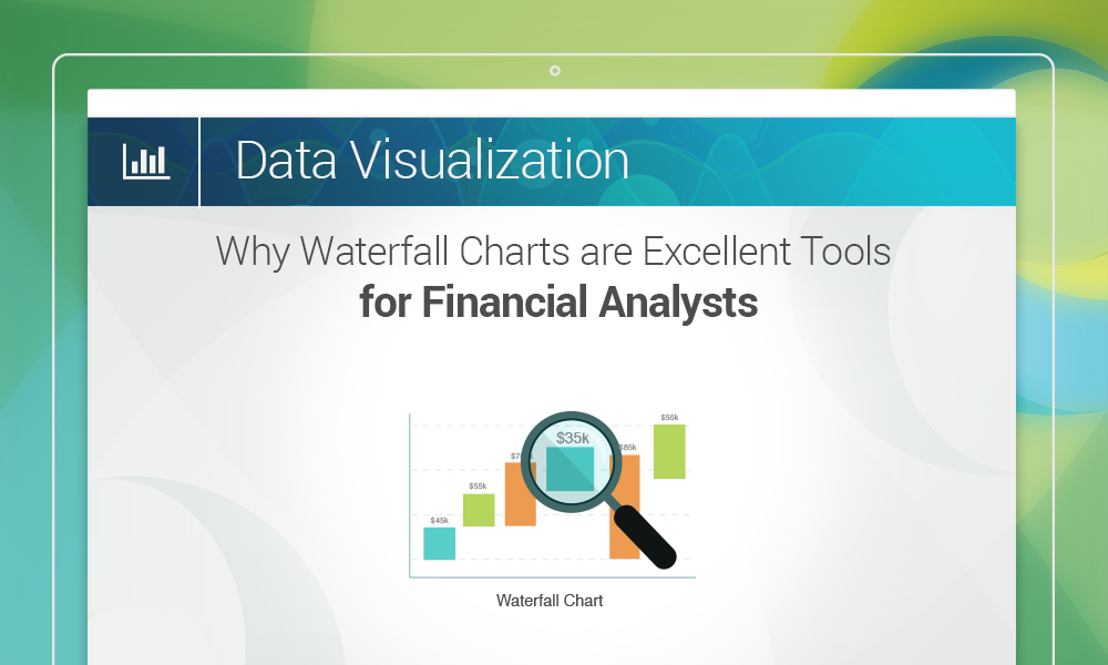
What are waterfall charts? Simply put – a waterfall chart is a diagram that is designed to represent cumulative values of a series of data in a sequential manner. This can be effective in various situations, including conducting a financial analysis.
How waterfall charts can help a financial analyst
If an analyst wants to study how profitable an organization is, he/she needs to build waterfall charts with the data. That way, he/she will be able to focus on the following, among other factors, at a glance.
- The profits made by the organization on a yearly basis.
- The investments made by the organization during specific time periods.
- The time periods when the company made the most profits or sustained the worst losses.
- The sources of revenue that proved to be most valuable for the organization.
With all this data, the analyst can get down to proposing strategies for the organization to improve profits and manage investments better, reducing losses as much as possible.
What to remember when building waterfall charts
There are a few best practices that an analyst can follow, to ensure waterfall charts look better, and are easier to understand. Here are a couple of those:
- Using contrasting color schemes to indicate the nature of the values is a good idea. For instance, the analyst can use warm colors (red, orange, brown, etc.) to indicate increases in values and cool ones (blue, green, magenta, etc.) to indicate decreases in values.
- Mentioning the values of each segment over its corresponding column on the chart is nice, since it helps viewers know the value instantly, instead of looking at the axes and trying to gauge the values from there.
Using Collabion Charts for SharePoint, it is possible for financial analysts to build beautiful Waterfall charts by connecting to different sources containing business data, such as SharePoint lists, SQL Server/Oracle databases, Microsoft Excel workbooks, CSV files, BDS, BDC, and many others through ODBC. More information on how to build these charts can be found here.