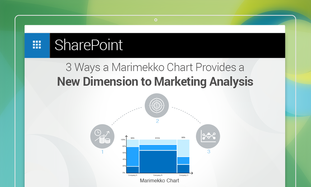
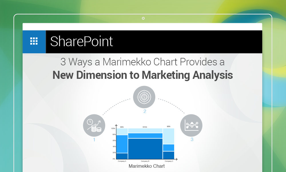
What is a Marimekko (or, as it is often referred to, mekko) chart? As far as a textbook definition is concerned, it is a two-dimensional stacked chart, in which the heights of the individual segments and the widths of the columns can all be variable. Also, the widths of individual columns are scaled, so that, together, they fill up the entire available chart area. Lastly, there is no white space left between two consecutive columns in a mekko chart, so that a viewer can quickly notice the differences in their widths. How do these qualities of a mekko chart help with marketing analysis? Let’s see.
Highlighting relationships between investments and profit margins
With a Marimekko chart, it is possible to study the relationships between investments and profit margins, simply by plotting the two along different axes. More than anything else, this helps top level management determine whether the effects of investments over profits are tapering off over a certain limit. What’s more – the data can be expressed either as absolute figures, or percentage values.
Studying profitable segments in the target market
Using a mekko chart, it is possible to dive deeper into the data, to locate marketing segments from which the company is making maximum profits. This can be done simply by plotting the revenue figures along one axis, and the market segments long another. That way, the management can quickly identify market sectors, where the company should invest more.
Squaring off with competitors on market penetration rates
With the help of a Marimekko chart, it is quite easy to compare the rates of market penetration of a company and its competitors. All an analyst needs to do is to plot market penetration rates of the company and the competitors along the same axis, and introduce a dotted line where the penetration rate of the company ends. That way, it is possible to gauge where the company is ahead of its competitors and where it’s not, at a glance. This can help investors adjust their investments based on returns from specific market segments, or channel more funds to an underperforming segment to boost profits.
Using Collabion Charts for SharePoint, which can be downloaded from here, it is possible to connect to a wide range of data sources (including but not limited to SharePoint lists, SQL Server databases, Oracle databases, Microsoft Excel workbooks, BDS, BDC, CSV, and others through ODBC) and build Marimekko charts with SharePoint 2007, 2010, 2013, and 2016. More information on how to build these charts can be found here.