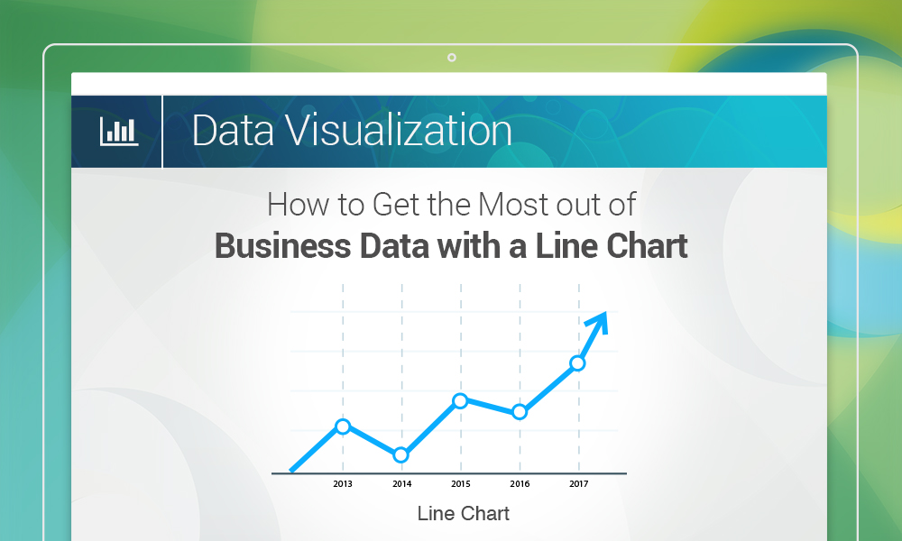

The roots of the line chart, often also referred to as the line graph, can be traced as far back as the 10th or 11th century, making it the oldest type of chart ever made. Humankind has come a long way in making way more complex charts since then. However, the humble line chart can still pull its weight, especially when a user needs to plot continuous data in a chart and identify trends or patterns in them.
Ideal scenarios for using line charts
Line charts work exceptionally well when the user looks for large changes in data values over time. Some of the situations when this ubiquitous chart can be useful include the following:
- The amount of rainfall in a region over many years – By plotting the amount of rainfall in the region on one axis and the years on another, it is possible to quickly spot years when the amount of rainfall was exceptionally high or low.
- Rise and fall of the value of a stock over time – If the value of a particular stock is plotted against time, then it is easy to spot when its value rose to the highest point, or sank to the lowest one. It may also be possible to predict when the value of the stock would rise again, if sufficient amount of data is available.
3 ways to build better line charts
Line charts look beautiful and are easy to comprehend, provided they are built properly. The following pointers may help users in creating better line charts.
- Starting the axes from the zero point is better than using an arbitrary numeric value for the purpose. Including the zero point makes it easier for users to gauge the rises and falls in the data values.
- Restricting the lengths of the axes so that the line(s) of the chart takes up around 50%-60% of the total area makes the finished chart look better. Any more than this and the chart may look too crowded, and any less might make the chart look less significant.
- Instead of providing a legend with names for the individual lines, it is better to put the corresponding names beside the lines themselves. That way, viewers do not have to go back and forth between the chart and the legend, and are able to study the line chart faster.
Bottom line
Line charts help viewers in identifying trends in a series of values over a particular time period at a glance, and can be helpful to almost anyone, from CEOs to financial analysts.
To display such data in SharePoint and extract important insights from it, users can use Collabion Charts for SharePoint to pull data from different sources such as SharePoint Lists, MS SQL/Oracle Databases, Excel/CSV files, ODBC supported databases or BDC and create beautiful line charts with just a few clicks.