Visualize all your business or operational data stored anywhere in SharePoint, in under 15 minutes, without writing any code.
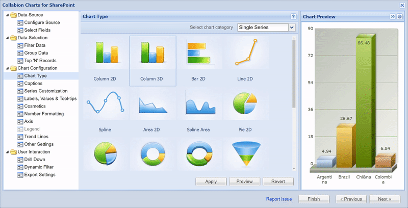
Create any chart you want, in minutes
Create any chart you want - whether a simple sales chart, a market share chart, or complex operational data plotted against multiple input variables - with the same ease of use. Use our intuitive wizard to connect to any data source, visually select your fields to plot on chart, select the chart type, and you're done! As simple as that!
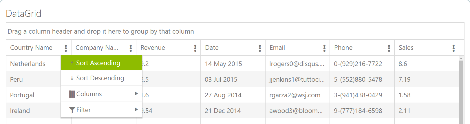
Switch to data grids, for when charts aren't enough
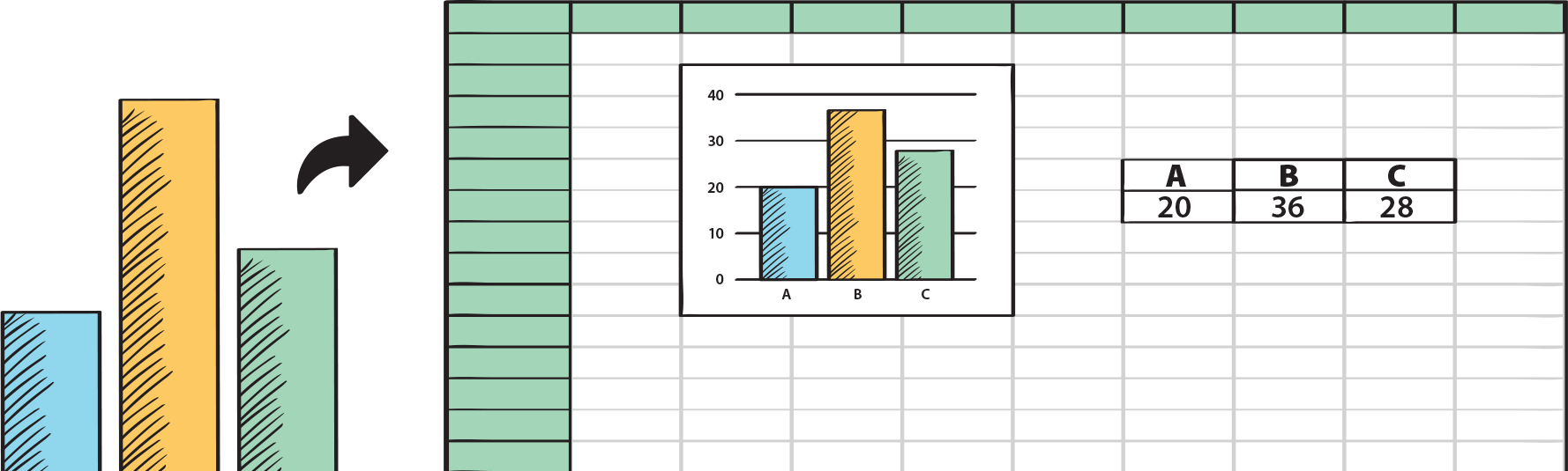
While charts are a great way to show an overview of the data, if the need of the hour is to display tabular data in a data grid or table, with filtering and pivot capabilities, we got you covered - the same wizard can be used to render the data in a tabular view, with all the data sources supported. Stop messing with complex Excel services or home-grown hacks, and elegantly display all your data within your page, in just a few clicks.
Wherever and however your data resides, we can connect to them
We understand that SharePoint is the central system for you to access multiple applications and data sources like Lists, databases (SQL/Oracle/ODBC), plain CSV files, other web parts, or even LoB applications. And that's why we connect to all of your systems and data sources, with the same ease of use. Pick the right data from each source, filter them, and render them as separate charts on a single dashboard, to get a bird's eye view of your entire work!

2D or 3D: Take your pick; we love them both!
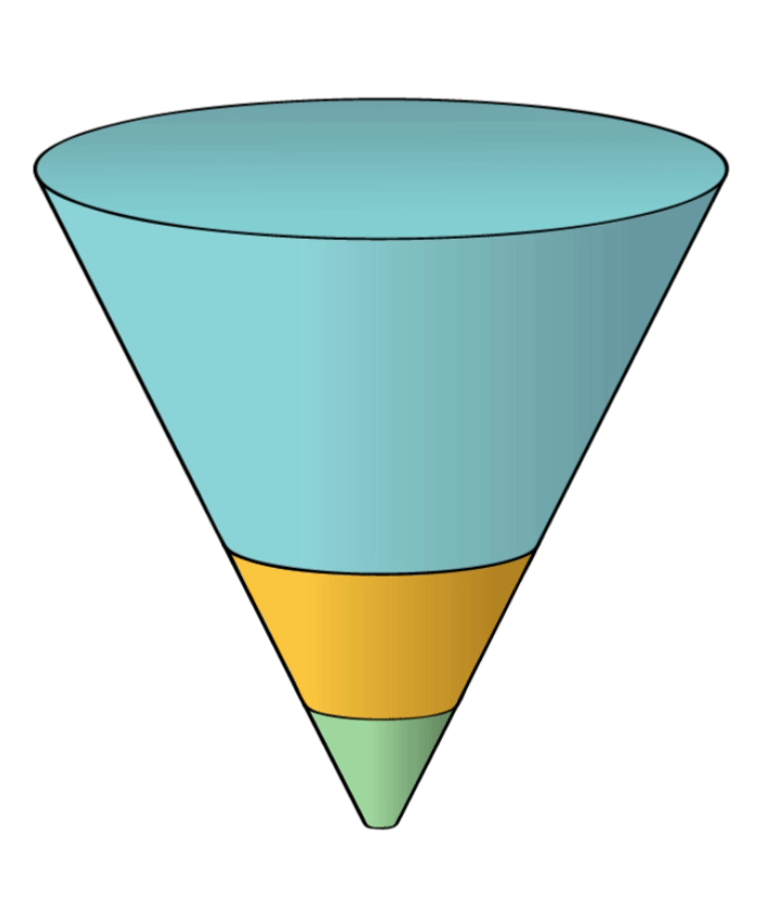
The purists in us love 2D, but we love the glamour of 3D as well. Not only those are stunning to look at, but they are highly interactive as well. Just for kicks, try slicing or rotating one of our delicious pie or doughnut charts. Or, try the slicing option on our funnel and pyramid chart, and the beautiful animations on each of our charts, which are sure to add zing to your work day.
Special charts for that special data
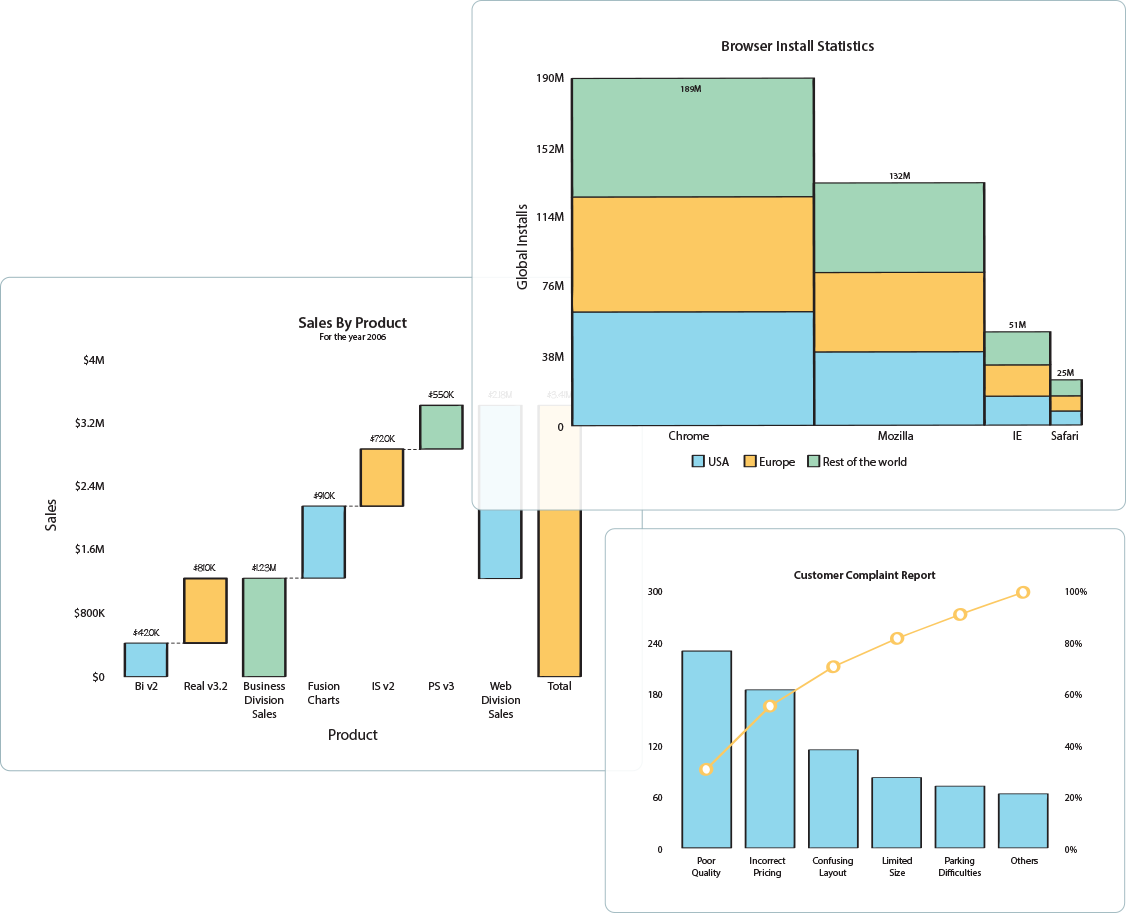
Not all data is created same! So why should you force-fit the wrong visualization on top of your specialized data? When it comes to showing composition of profitability analysis, or inventory audit, use the Waterfall Chart. For the 80-20 Pareto Analysis, straight up jump to our Pareto Chart. Similarly, for market share, use the Marimekko Chart. For most business use cases, we've got the right chart type for you already included.
Lots of data? No problem
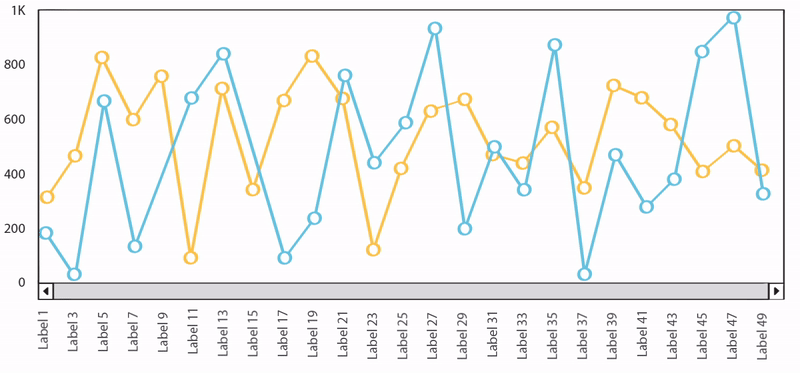
Big data or small data, we got you covered! With our Zoom-line chart, you can plot tens of thousands of data in a single chart, and then zoom and pan across the chart. This is very useful, for when you want to look at a 30,000 feet view of the data, and then narrow down to a specific point to identify the root cause.
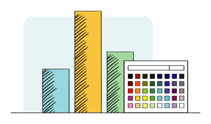
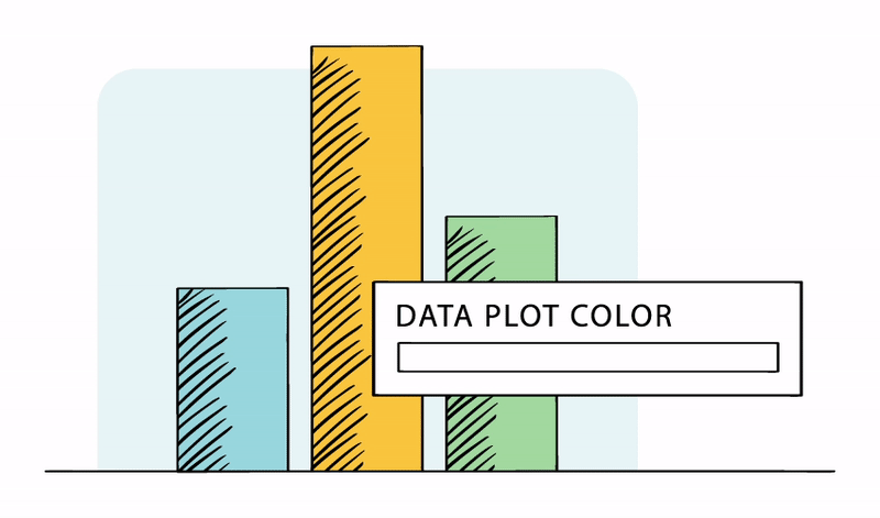
Visually brand the charts the way you want them
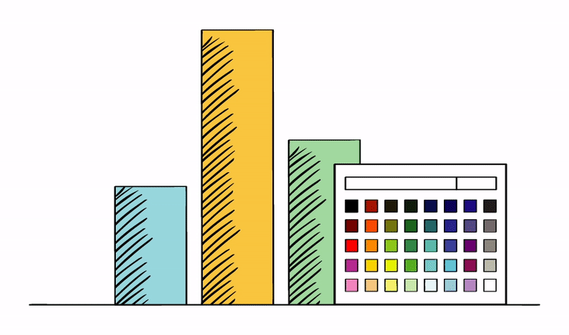
With Collabion, you can customize every aspect of your chart to make it look & feel like your company's brand. Whether it's fonts, colors, spacing, or even additional background images or logo on top of the chart, the control is in your hands! For the grid, there are pre-built themes that can instantly overlay to change the look & feel.
Look at your data through different perspectives to find answers toyour business questions.
See data that is relevant to you
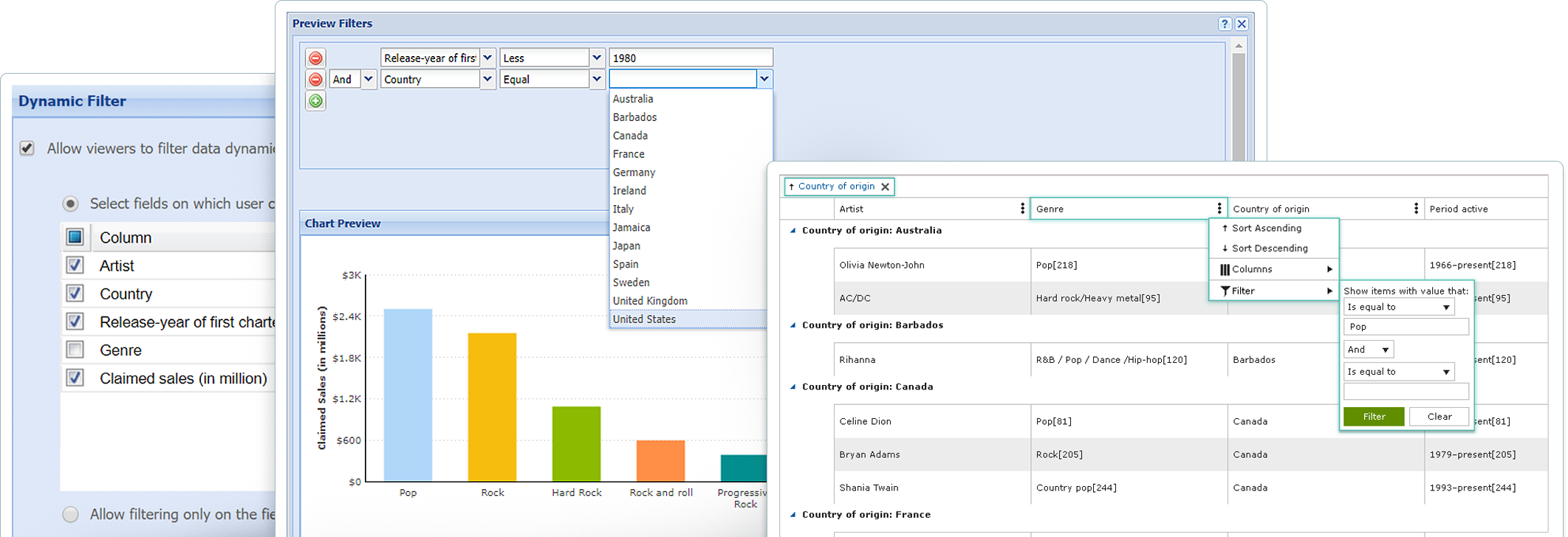
When trying to answer questions from your data, the full view of data can be intimidating, and isn't very helpful. The right way to do it is to slice your data into smaller segments, and then look at it from various perspectives. Collabion allows you to filter your data in any way you want - including creating smaller segments based on conditional filters, showing top 'n' records, and even applying roll-up. The filters can either be applied per chart/grid, or to the entire dashboard.
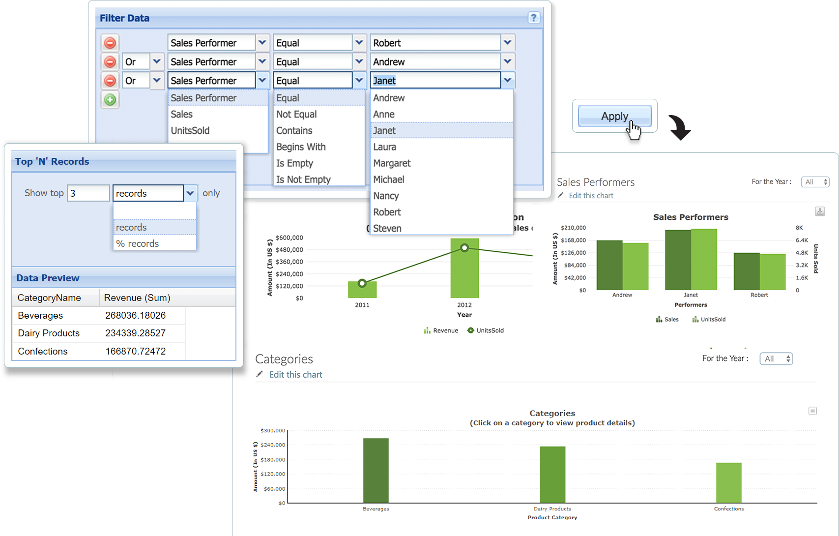
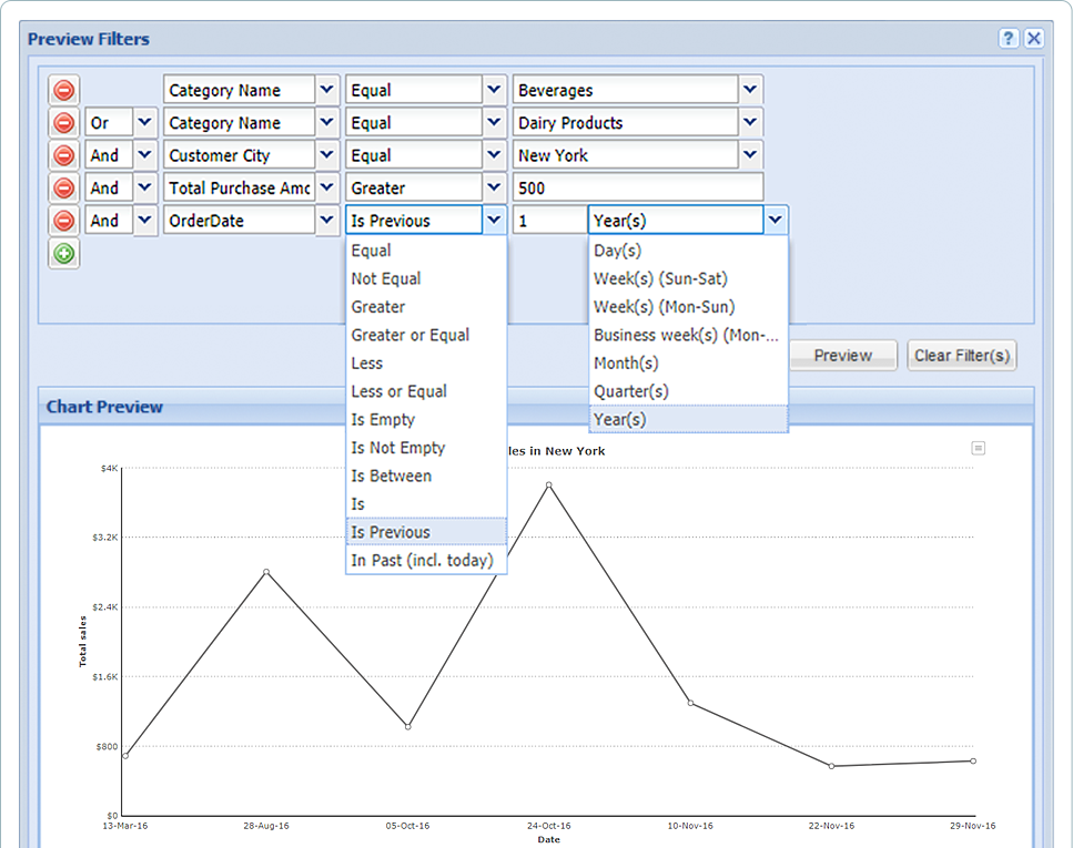
Start with simple filters, and then add complexity as you go
You can start with the simplest of filters (e.g., Sales in New York), and then keep on adding more filters to create a complex condition-set (e.g., Sales in New York, for past 1 year, where Order value was greater than $500, and Category equals Beverages & Dairy Products'). The filters can be added in both AND or OR boolean mode, and support text, numeric, and date filtering. For each filter, you have a comprehensive set of operators (e.g., equal to, contains, less than, greater than, between etc.) that lets you build the search parameter that you need. In addition, there are helpful date functions like ‘Past n days', support for weeks & quarters, and many more.
Allow your colleagues to create their own views of data
Once you've created your dashboard, your colleagues may want to apply different segments or perspectives to the same data. Instead of having to replicate the chart, they can simply use Collabion's dynamic filters, which just affect their view of data, without changing the original dashboard. This lets everyone in your team become a data-driven expert, without any additional effort on your side.
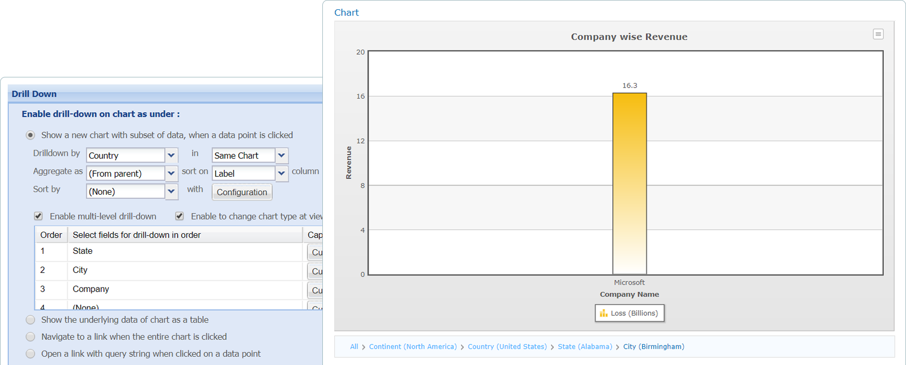
Roll-up your data and then explore through drill-downs
Imagine you're selling your wares across hundreds of cities in US, and you want to see your sales aggregated by state first, and then within state, sales by city. This is a classic use-case of rolling-up of data. Collabion DataParts allows you to easily roll-up data for any number of levels (think Continent > Country > State > City > Zip Code), and automatically adds drill-down in your charts to help you navigate from top-level to any level.
Stay on top of what's happening in your department or business. See what's relevant to you, highlight the trends and define your own custom views of data.
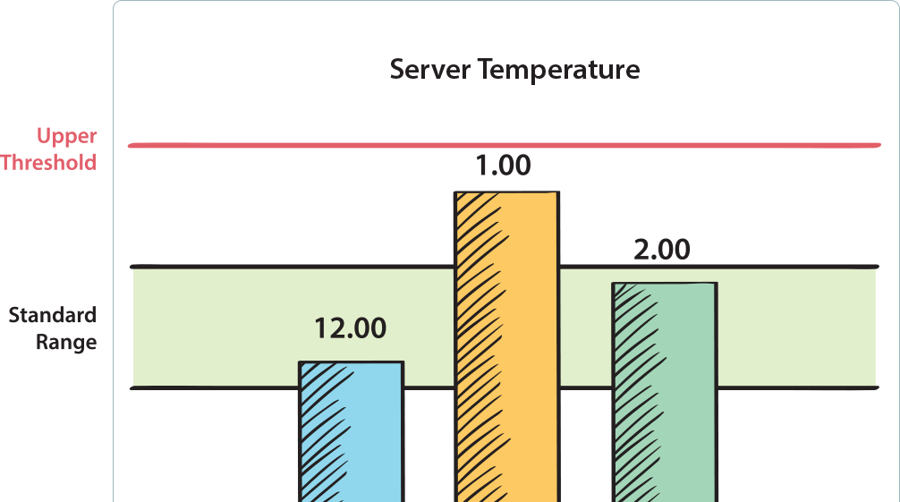
Add trend lines for quick comparison and monitoring
Whether you want to ensure you've hit your sales targets, or inventory is above the minimum re-ordering level, Collabion Charts allows you to add custom trend-lines on top of your charts, so that you can get quickly get the context and take necessary action. The trend lines can be rendered as both lines or ranges, so as to suit your requirements.
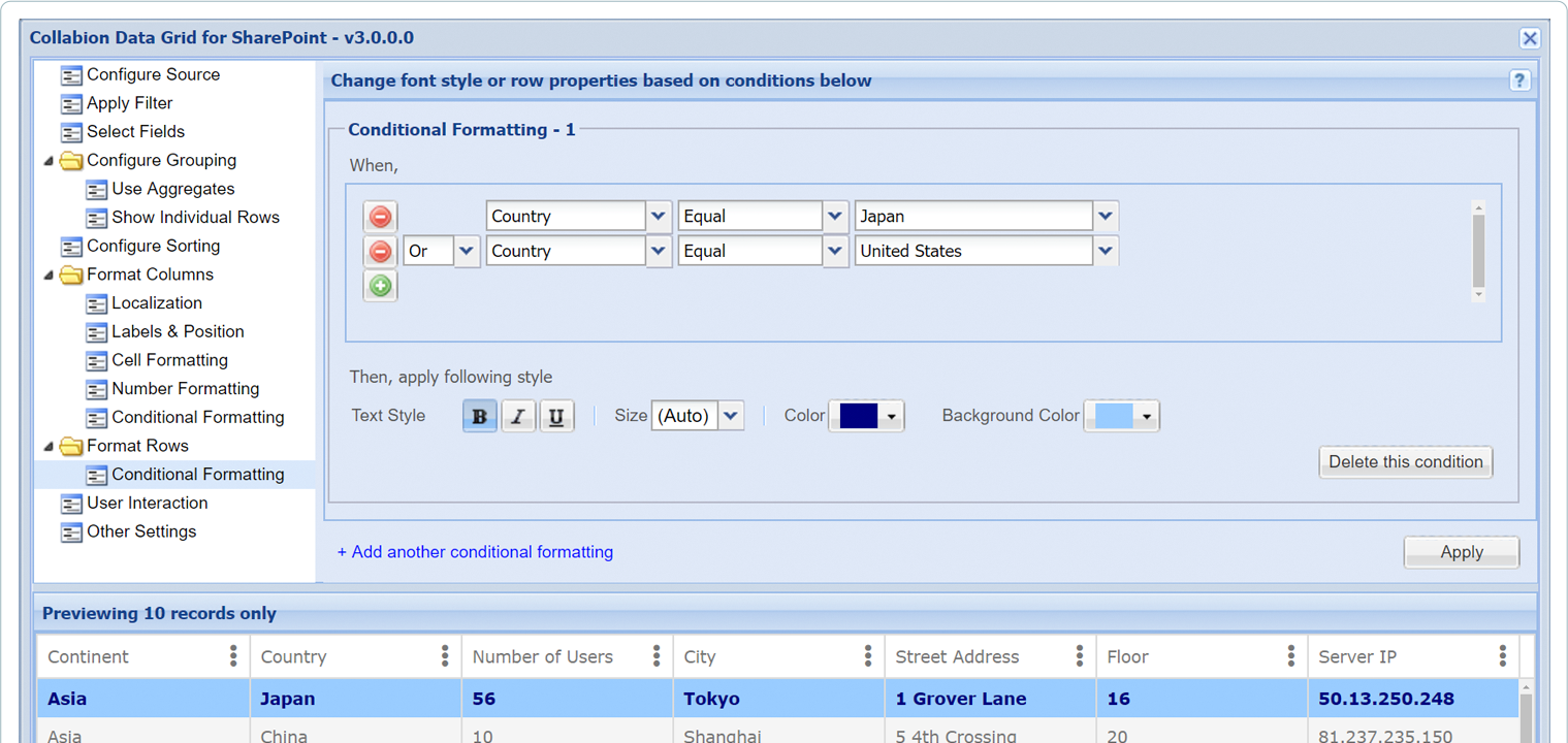
Highlight individual rows based on your custom logic
Whether you need to highlight full rows of a table, or specific columns in a row, Collabion Grid allows you to specify custom conditions that can change the color, font or even background color, based on the value of that row or column. You can use a combination of logical and date operators across your values to ensure that you never miss an exception or an outlier. In addition, if the column in grid is a reference to a person (e.g., you), you can also highlight them easily using the Person Filter.
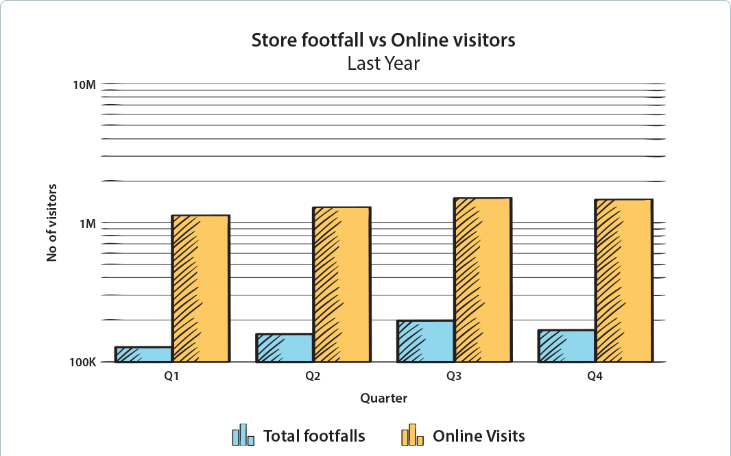
Monitor exponential changes using logarithmic axis
While the linear axis on charts are good to see trends, if you need to monitor changes that are exponential in nature, use the logarithmic axis charts to highlight the rate of change, so that you do not miss any such change.
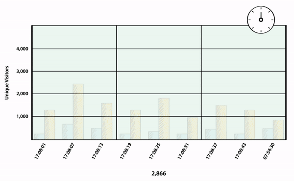
Always stay on top of your latest data with real-time refresh
Collabion Charts can be configured to refresh all the data in your chart at periodic intervals, custom defined by you, so that your view of the data is always current. Use this to monitor real-life sales, inventory levels or other operational data.
Collaborate with your other team members, to share your discoveries or explore data together - all within SharePoint, and without the hassles of email.
Share dashboards with your colleagues
Sharing your dashboard has never been this easy, ever. Any dashboard that you create using Collabion is available to all the other users in your organizations (who have permission for the page). No more emails, or notifications or attaching Excel files, ever. Any change to the data or dashboard is automatically reflected, without any additional work. In addition, if you want to collaboratively build dashboards with your colleague, just give them Edit rights to the SharePoint page, and they can make the relevant changes. Now, work with your team in real-time collaboration mode - always.
Export your data to share with others
If you need to export your data to Excel to share with anyone out of organization, use the one-click export options and get data for the chart or grid easily in neatly formatted Excel Workbook. If you're exporting a chart, the bonus is that you also get an exported version of the chart in Excel, along side the data table.
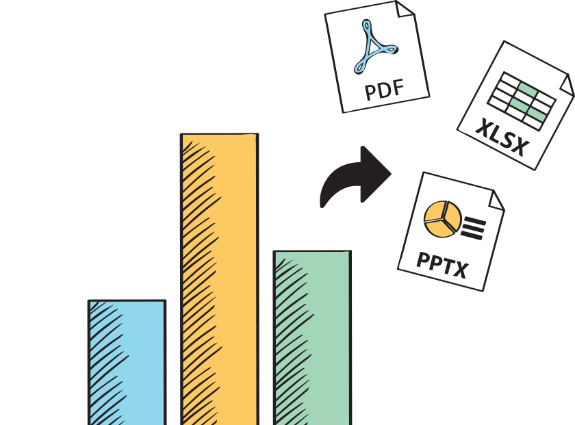
Take your charts to PowerPoint, Excel or even PDF
Not only you can export data, you can also export the charts directly to Excel or PowerPoint directly from SharePoint. No need to take screenshots or crop them - by default Collabion selects the best formatting options for the chart and exports it for you. Collabion also lets you export charts as image or PDF, for when you need them