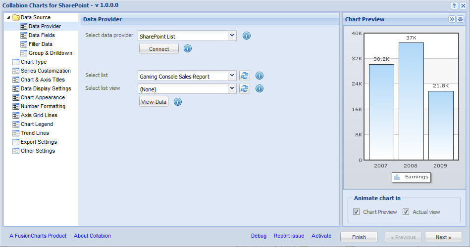
The above image shows the Collabion Charts Wizard. Mainly the wizard is comprised of three different components. They are:
In this page we will briefly discuss about the three panes of the wizard.
Navigation Pane: The navigation pane provides you with a list of sections which contains all the available configurable options. It contains the following:
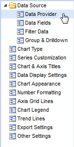
- Data Source: This section allows you to select the source of the data, select data fields, filter data, group data and to create drill down charts.
- Data Provider: Allows you to select the source of the data provider.
- Data Fields: After selecting the data source this section allows you to choose selective data fields which you want to include in the chart.
- Filter data: This section allows you to add filtering options to your data.
- Group & Drill down: This section allows you to group the data and to create drill down charts.
- Chart Type: Allows you to select the type of chart which you want to use to represent the data.
- Series Customization: Allows you to customize the configuration of the data set(s) present in the chart.
- Chart & Axis Titles: Allows you to add the caption, sub-caption and the axis titles of the chart.
- Data Display Settings: Allows you to customize the display options of the labels, values and the tool tips of the data plots.
- Chart Appearance: Allows you to customize the visual properties of the chart.
- Number formatting: Allows you to configure all the number formatting properties.
- Axis Grid Lines: Allows you to configure the axis grid lines.
- Chart Legend: Allows you to configure the properties of the legend.
- Trend Lines: Allows you to configure the settings of the trend lines.
- Export settings: Allows you to configure the export settings.
- Other Settings: Allows you to configure the Chart messages, Hotspot settings, custom attributes and the rendering settings.
Configuration settings pane: This pane allows you to set and apply all the available configurations of based on the section selected in the navigation pane.
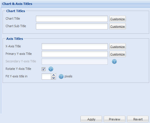
This pane also contains three buttons. They are:
- Apply - This button allows you to apply all the changes made in the configurable options.
- Preview - This button allows you to preview the chart before applying the changes made.
- Revert - This button allows you to revert back all the changes made in the configurable options.
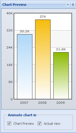
Chart Preview pane: In this pane you can view the chart and how it looks with all the configurable changes made.
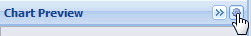
Apart from previewing the chart, this pane also allows you to view the data of the chart in XML format. Click the Gear icon on the top-right corner of the wizard to view the XML data.
The data will appear as shown below:
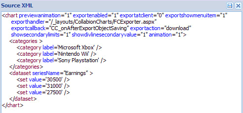
You can also save the XML data. Click the save button in the Source XML dialog box.
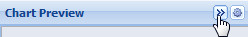
You can also expand or collapse this pane by using the expand collapse button present beside the gear button.
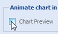
From this pane you can also stop the chart from animating. Follow the steps given below:
- Clear the Chart Preview check box to stop the chart from animating in the chart preview pane.
- Clear the Actual View check box to stop the chart from animating when you finally view the chart in SharePoint.

Note: By default, both the check boxes remain selected.
There are three more buttons present in the wizard. They are as follows:
- Finish - This button allows you to exit from the wizard.
- Previous - This button allows you to navigate to the previous section in the navigation pane.
- Next - This button allows you to navigate to the next section in the navigation pane.