Drill down option allows you to create a summarized chart first and then click on the charts dataplot (column, bar, points or line, pie/doughnut slices etc.) to open another chart showing detailed data or a table of data or a new web page.
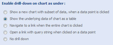
To create a drill down chart, you need to go the Drill Down option under User Interaction block in the navigation pane. There are four options to choose from; let’s learn about them.
- Show a new chart with subset of data, when a data point is clicked
- Show the underlying data of chart as a table
- Navigate to a link when the entire chart is clicked
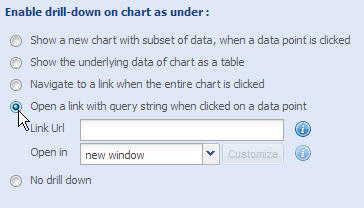
- Open a link with query string when clicked on a data point
Note: No drill down is the default option; as you select any of the other available options, drill-down feature gets activated.
Show a new chart with subset of data, when a data point is clicked
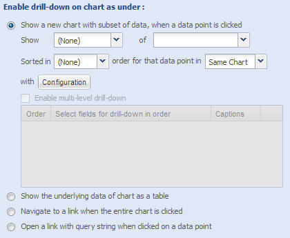
Data grouping is compulsory to create this type of drill down chart. This option allows you to create a summarized chart first and then click on the chart’s dataplot (column, bar, points or line, pie/doughnut slices etc.) to open a chart showing detailed data.
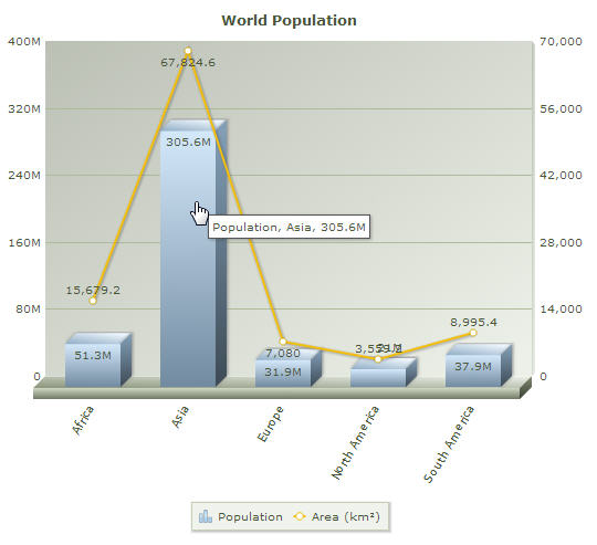
Assume you are creating World Population chart. The summarized chart shows Population and Area (sq. km) of each continent. Continent names appear as the x-axis labels. Summed up values of the data fields Population and Area appear as columns and lines. The chart looks like this.
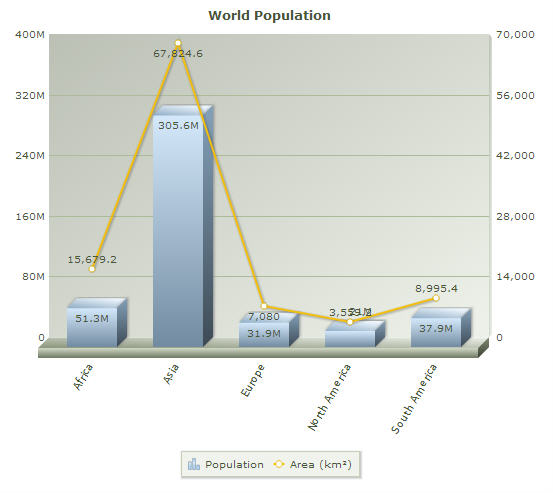
Let’s see how the underlying data has been grouped:
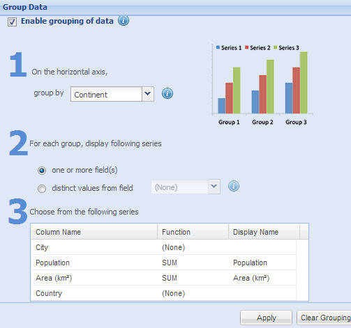
Take a look at Data Selection > Group Data to know about grouping of data in details.
Now, to create the World Population drill down chart, you need to follow these steps:
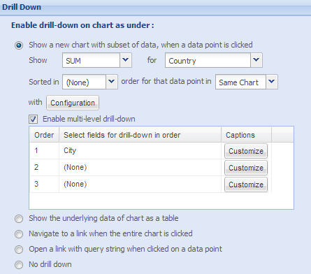
- Select SUM from the dropdown list beside the label Show.
- SUM: Provides the total of all the values under a group.
- AVERAGE: Provides the average of all the values under a group.
- COUNT: Provides the count of all the values under a group.
- MIN: Provides the lowest of all the values under a group.
- MAX: Provides the highest of all the values under a group.
- Select Country from the dropdown list beside the label of.
- You can choose Ascending, Descending or None from the Sorted in dropdown list to organize data in that order.
- In the fourth dropdown list, select Same Chart if you want the next level chart to appear in the same chart area and select Pop-Up if you want the next level chart to appear as a pop-up.
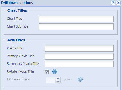
- Click Configuration button to add captions to your drill down chart.
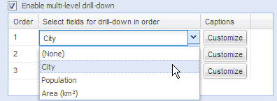
- Check Enable multi-level drill-down option in order to allow users navigate to more than one layer deeper into the underlying data.
- Next, in the table, select the data field you want to display at different layers. In this example, we will go up to City level, hence, City is selected in the first row.
- Click Customize to add chart title, axis title etc. if required.
The drill down chart is ready. This is the snapshot of the configurations set in the chart wizard.
Viewers can see and explore the drill down chart; data plots are clickable.
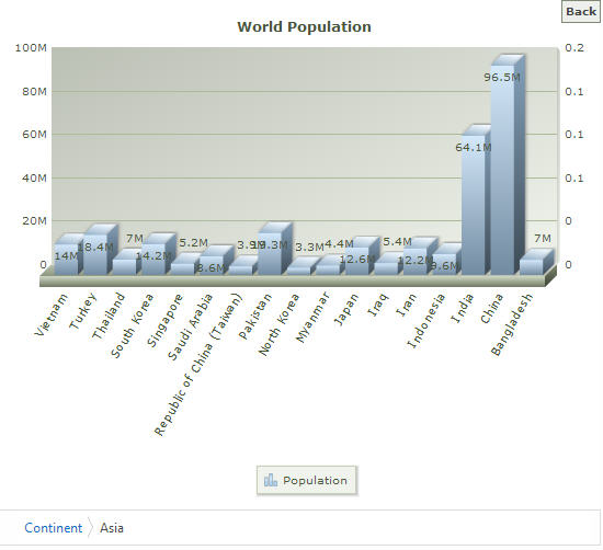
Click on a data plot to go one level deeper in to the data; take a look at the image below:
Click on a data plot to go one more level deeper into data and see the city specific data.
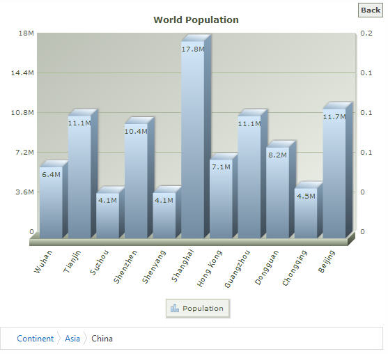
The breadcrumb at the bottom of the chart shows the path you navigated. At any point of time, click the Back button at the upper right corner or the breadcrumb links to go back to the previous level.
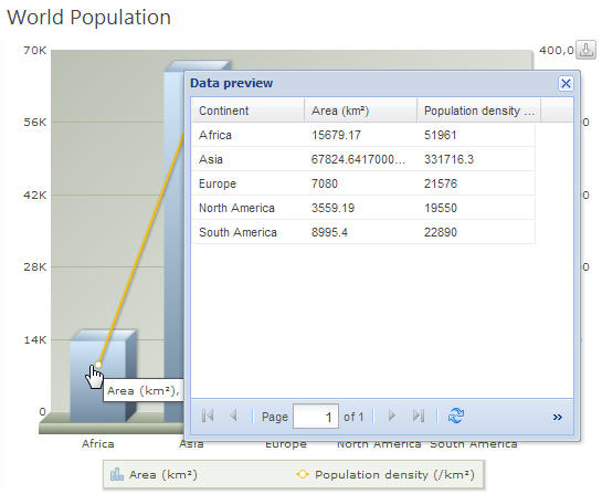
Show the underlying data of chart as a table
This option allows you to let the users see the underlying data as a table. Select the option and click Apply.
Now, when the user clicks on the chart, the underlying data is displayed in a table.
Navigate to a link when the entire chart is clicked
You need to specify following information to link the entire chart to a web page. If the user clicks anywhere on the chart area, the specified web page appears.
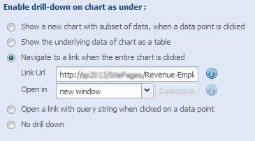
- Link URL: In the Link URL text box, enter the location of the web page.
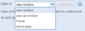
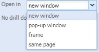
- Open in: You can specify the target window of the external link, that is, whether the web page will open in a new page, a pop-up window, in a frameset or in the same page.
If you select to open the web page in a pop-up window, one Customize button appears on right. Click on it to customize the pop-up window.
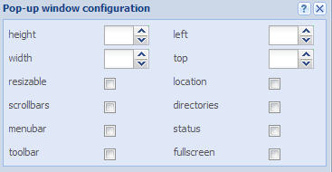
Pop-up configuration- Height: You can specify the height of the pop-up window in pixels.
- In the height up and down box, click the up and down arrows to increase or decrease the height of the pop-up window. Alternatively, you can also enter the appropriate height.
- Width: You can set the width of the pop-up window in pixels.
- In the width up and down box, click the up and down arrows to increase or decrease the width of the pop-up window. Alternatively, you can also enter the appropriate width.
- Resizable: You can manually resize the pop-up window by dragging the edges of the pop-up window.
- Select the resizable check box to enable manual resizing of the pop-up window.
- Scrollbars: You can display or hide the horizontal and vertical scrollbars that normally appear when the page content is larger than the screen.
- Select the Scrollbars checkbox to display the scrollbars.
- Menu bar: Select the menubar check box to display a menu bar at the top of the pop-up window
- Toolbar: You can display the main toolbar, with the back, forward, stop buttons.
- Select the Toolbar checkbox to display the various toolbars.
- Left: You can specify the distance of the pop-window from the left edge of the screen.
- In the left up and down box, click the up and down arrows to increase or decrease the distance of the pop-up window from the left edge of the screen. Alternatively, you can also enter the appropriate distance in the left up and down box.
- Top: You can set the distance of the pop-window from the top edge of the screen.
- In the top up and down box, click the up and down arrows to increase or decrease the distance of the pop-up window from the top edge of the screen. Alternatively, you can also enter the appropriate distance in the top up and down box.
- Location: You can display the location bar. A location bar is the address bar you can type and view the URLs.
- Select the location checkbox to display the location bar.
- Directories: You can display or hide any additional toolbar, like the links bar in Internet Explorer.
- Select the directories checkbox to display the additional toolbars.
- Status: Select the status checkbox to display the status bar at the bottom of the pop-up window.
- Full screen: Select the Fullscreen checkbox to open the pop-up window in full-screen mode.
Select frame to display the web page in a frame. - In the ID text box, enter the ID of the target window, if the web page opens in a pop-up window or in a frame
Open a link with query string when clicked on a data point
This is a smart drill-down feature that allows you to open a web page and pass certain parameters with the URL when someone clicks on a data point in your chart.
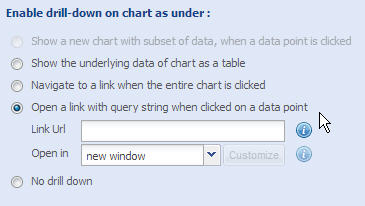
- Set the URL of the web page that opens when clicked on any data point.
- You can configure the URL to pass pre-defined parameters as query string.
Here are the macros which can be used as query string parameter:
- {caption} - Chart Title
- {subcaption} - Chart Sub Title
- {valueField} - Series Column Name
- {value} - Series Column Value
- {labelField} - Label Column Name
- {label} - Label Column Value
- {xAxisTitle} - X Axis Title
- {yAxisTitle} - Primary Y Axis Title
- {sAxisTitle} - Secondary Y Axis Title
Following two macros are applicable for bubble chart only:
- {zAxisField} - Z Axis Field Name
- {zValue} - Size / Z Value of the bubble
On the target page, there should be some mechanism (such as Query String (URL) Filter Web Part for SharePoint pages) to capture the parameters in order to make the interface more interactive and intuitive. Look at the example below to know more. - You can choose to open the web page as a new page, pop-up or frame. Click here to know about Open in options in details.
Configuring a Chart with Query String
This example explains how the Query String-based drill down charts can be used in real life.
How the charts are configured:
Let's take a look at the basic set up first.
- We have Chart 1 (Capitalization Data) - It shows approximate Capitalization data of top industries.
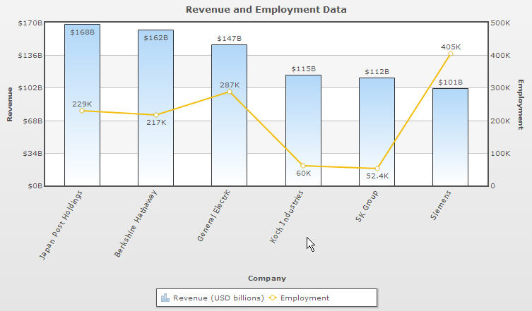
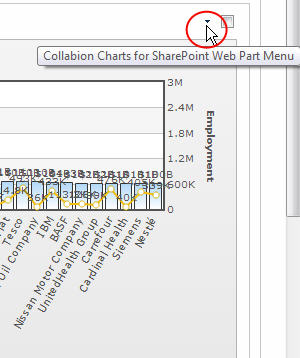
[screen] - We have Chart 2 (Revenue and Employment Data) - It shows Revenue and Employment data of major companies distributed under top industries.
[screen] - Both the charts render on separate SharePoint pages.
How the final interface will work:
Columns on Chart 1 are clickable (need to be configured); on click it redirects the user to the SharePoint page that contains Chart 2. A macro captures the column label and sends it as a Query String to the destination page (here, the destination page is the SharePoint page that contains the Chart 2).
The page where Chart 2 sits has a Query String filter. This filter accepts the parameter and filters Chart 2 accordingly.
As a result, Chart 2 shows the Revenue and Employment data of the companies that belong to the Industry, user clicked on Chart 1.
Excited? Let’s see how to configure this set up:
- Go to the page that contains Chart 2.
- Open the page in Edit mode.
- Insert Query String (URL) Filter.
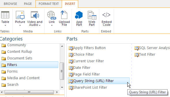
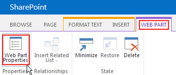
- Select the Query String (URL) Filter. Go to Web Part -> Web Part Properties as shown in the image below.
- Edit Web Part pane appears. You need to fill in 2 compulsory fields – Filter Name and Query String Parameter Name. You can specify any meaningful terms there. The Query String Parameter Name specified here will be required to configure the Query String for Chart 1.
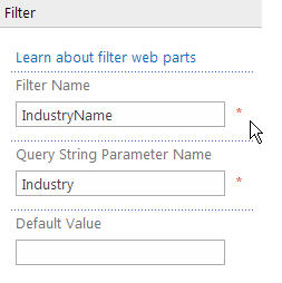
As you can see, in this example, Filter Name is IndustryName and Query String Parameter Name is Industry. - Click OK to save the settings.
- Now, we have to connect the Query String (URL) Filter Web Part with Collabion Charts for SharePoint Web Part.
To do this, click on the down arrow at the top right corner of the chart.
- Context Menu appears. Click on Edit Web Part.
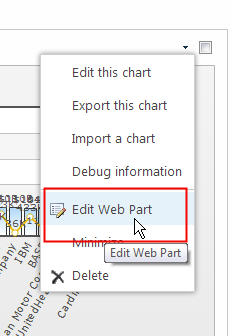
- Click the Down arrow at the upper right corner again. Context menu appears. Go to Connections -> Get Filter for Collabion Charts From -> Query String (URL) Filter.
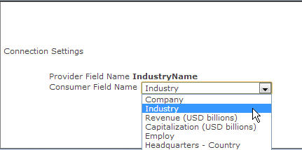
- Configure Connection window appears. You need to specify which field of the chart data should be connected with the filter web part. In this example, we will connect the filter with Industry field.
- Save this page.
- Go to the page that contains Chart 1.
- Open the page in Edit mode.
- Click the Down arrow at upper right corner. Collabion Charts for SharePoint Web Part Menu appears. Click Edit this chart. Chart Wizard appears.
- Go to Drill Down option under User Interaction block in the navigation pane.
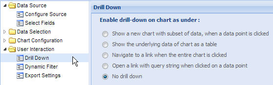
- Select Open a link with query string when clicked on a data point.
- In Link URL field, put the URL of the SharePoint page that contains Chart 2. Add the query string at the end of the URL. Here is the query string to capture the label value (which appears along X Axis) of the data plot.
http://*******/SitePages/Revenue-Employment-Data.aspx?Industry={label}
Please check the list of macros that can be used to capture specific data from the chart. - Select new window from the Open in dropdown list to open the second chart in a new window. You may also choose to open the second chart in a pop-up, frame or in the same page.
- Click Apply.
- Click Finish to close Chart Wizard.
And the charts are ready. Chart 1 shows Capitalization data for major industries. Click on any of the columns; e.g. Conglomerate.
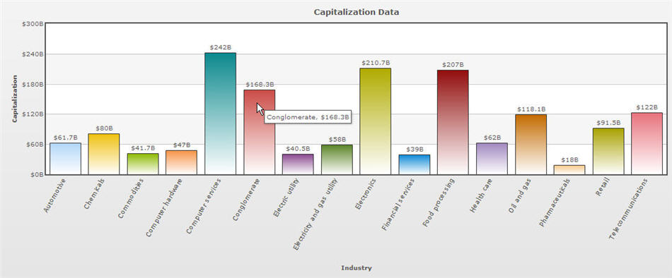
It takes you to Chart 2 and shows Revenue and Employment data of companies that belong to Conglomerate group.