Series refers to the data series in a chart. The chart derives its data values from the data series.
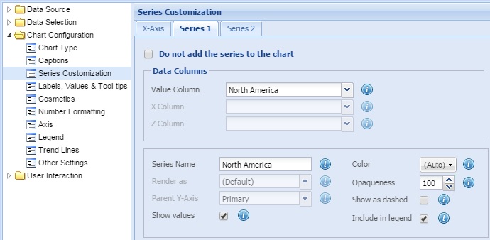
Note: In single series charts, only one Series tab is available for customization. In multi-series charts, the number of Series tabs available depends on the number of series plotted on the chart.
Learn how to:
- Hide a data series from the chart
- Specify the source for a data series
- Customize the general properties
- Customize anchor properties
- Customize plot border properties
- Customize line properties
Hide a data series from the chart
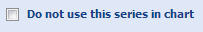
You may choose not to show a data series in the chart. To do this, simply check the Do not use this series in chart option.
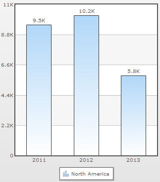
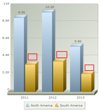
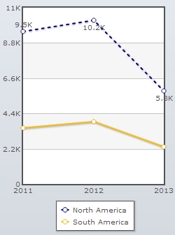
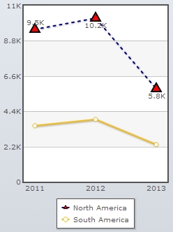
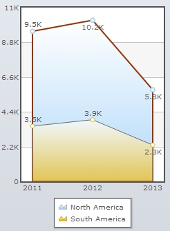
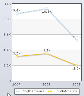
Here is a chart that shows revenue of an enterprise in two regions - North America and South America.
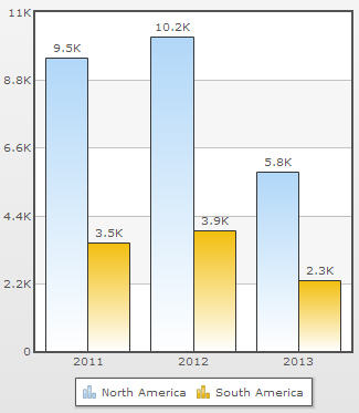
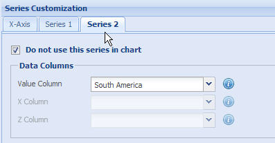
Assume, you want to hide the dataplots that represent South America. You have to hide South America series.
To do this, go to the Series tab that represents South America and check the Do not use this series in chart option. Click Apply.
The series is not visible in the chart any more.
To bring the series back on the chart, simply uncheck the Do not use this series in chart option.
Specify the source for a data series
You can specify the field or the data column of the data provider from which the data series derives data values. For this, you need to configure the Data Columns section.
Note: The values available in the drop-down lists in the Data Columns section contain the names of all the fields or data columns that have been selected in the Select Fields page.
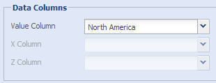
The steps for specifying the source for a data series can vary depending on the type of chart that you have selected.
For all charts except Scatter and Bubble
- Select the name of the field or data column from the Value Column drop-down list. Data values for the present series are derived from the selected field or data column.
- Click Preview to view the change.
For Scatter chart
- Select the name of the field or data column from the Value Column drop-down list. Values for the Y parameter of the scatter chart are derived from the selected field or data column.
- Select the name of the field or data column from the X Column drop-down list. Values for the X parameter of the scatter chart are derived from the selected field or data column.
- Click Preview to view the changes.
For Bubble chart
- Select the name of the field or data column from the Value Column drop-down list. Values for the Y parameter of the bubble chart are derived from the selected field or data column.
- Select the name of the field or data column from the X Column drop-down list. Values for the X parameter of the bubble chart are derived from the selected field or data column.
- Select the name of the field or data column from the Z Column drop-down list. Values for the Z parameter of the bubble chart are derived from the selected field or data column.
- Click Preview to view the changes.
NOTE:
Click Apply to apply the changes made.
Click Revert to undo the changes.
Customize the general properties
You can specify the properties common to all the dataplots in a series.
Learn how to:
- Specify the series name
- Render the series as a particular dataplot
- Specify the parent Y-Axis
- Display data values on the chart
- Include series name in legend
- Specify the color and transparency of dataplot
- Show dashed lines and dashed borders
Series name is the name that is displayed in the legend for a particular data series. By default, the name of the data series appears as the series name on the legend, just beside the icon of the data plots.
To change the series name, enter the intended name in the Series Name text box. Click Preview to view the change.
This setting is applicable to all Multi Series, Combination, Stacked, X-Y and Scroll charts.
NOTE:
Click Apply to apply the change made.
Click Revert to undo the change.
Render the series as a particular dataplot
Collabion Charts for SharePoint allows you to specify the dataplot type (column, line, and area) of a data series in Combination charts.
To specify the type of dataplot for the data series, select the required type of dataplot from the Render as drop-down list. The available dataplot types are Column, Line and Area. Click Preview to view the change.
By default, the (Default) option is selected. The (Default) option renders column as the dataplot in Single Y Combination charts. In Dual Y-Axis charts, the (Default) option draws a column for primary axis and a line for secondary axis.
This feature is available only in 2D combination charts.
NOTE:
Click Apply to apply the change made.
Click Revert to undo the change.
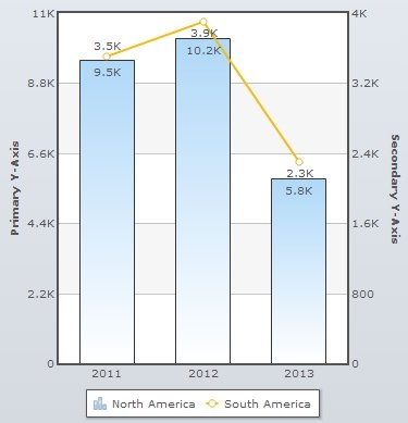
In Dual Y-Axis charts, you can specify the Y-Axis (primary or secondary) on which the data series is to be plotted.
To specify the parent Y-Axis of the data set, select the appropriate Y-Axis from the Parent Y-Axis drop-down list. If you select Primary, the data series is plotted on the primary Y-Axis. Similarly, the data series is plotted on the secondary Y-Axis if you select Secondary. Click Preview to view the change.
NOTE:
Click Apply to apply the change made.
Click Revert to undo the change.
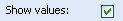
Display data values on the chart
You can display the data values on the chart of a particular series by selecting the Show values checkbox. This is applicable only for multi-series chart. Click Preview to view the change.
To hide the data values on the chart clear the Show values checkbox and click Preview to view the change.
In the image above, the data plots with hidden data values have been highlighted.
NOTE:
Click Apply to apply the change made.
Click Revert to undo the change.
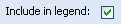
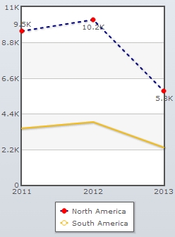
You can display the data series name in the chart legend box by selecting the Include in legend check box. Click Preview to view the change. By default, the Include in legend check box is selected.
To hide the data series name in the chart legend box clear the Include in legend check box and click Preview to view the change.
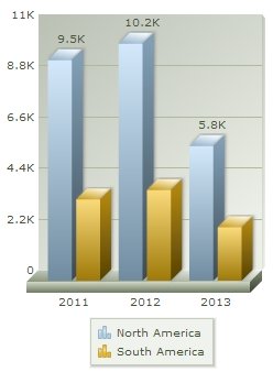
The chart above displays the legend icons for all the series plotted on the chart. In the chart below, the legend icon for the North America series has been hidden.
NOTE:
Click Apply to apply the change made.
Click Revert to undo the change.
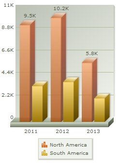
Customize the color and transparency of dataplot
You can customize a color and transparency for the dataplot that represents the series by using the following steps:
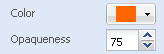
- Select the color of the dataplot from the Color drop-down color picker. Select (Auto) to make the chart automatically decide the color.
- Select or enter a value between 0-100 in the Alpha box.
The value 100 makes the dataplot completely opaque, whereas, the value 0 makes it completely transparent.
- Click Preview to view the changes.
A chart with customized dataplots looks as under:
NOTE:
Click Apply to apply the change made.
Click Revert to undo the change.
Show dashed lines and dashed borders
You can display the dataplot lines as dashed or broken by selecting the Show as Dashed check box. Click Preview to view the change.
In case of column and area charts, the borders are displayed as dashed.
The charts below displays the dataplot borders as dashed.
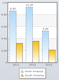
In a column chart, the plot border appears dashed; whereas, in a line chart, the dataplot appears as dashed.
NOTE:
Click Apply to apply the change made.
Click Revert to undo the change.
Anchors or marker points are used to represent each dataplot. Anchors help to locate the data values better in the chart. Anchors also display tool-tips showing the details of the data points when the mouse is hovered over them.
Anchors are available in the following charts:
- Line charts
- Spline charts
- Scatter charts
- Area charts
To display anchors on the chart, select the Anchors checkbox and click Preview to view the change. By default, the Anchors check box is selected and the anchors are displayed on the chart.
The anchor options are enabled only if the Anchors checkbox is selected.
Clear the Anchors checkbox if you don’t want the anchors to be displayed on the chart.
Learn more about:
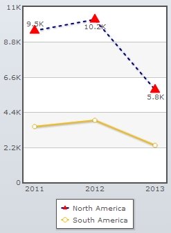
You can configure the anchors by following the steps below:
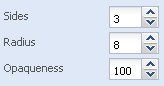
- Select or enter the number of sides of the anchor In the Sides box.
You can change the anchor shape by changing the number of sides of the anchor. For example, if the number of anchor sides is set to 3, the anchor is shaped as a triangle and it is formed as a square if the number of sides is set to 4. By default, anchors appear round in shape.
- Select or enter the radius of the anchor in the Radius box.
You can determine the size of the anchor by specifying its radius value. A higher radius value results in a bigger anchor.
- Set the opaqueness of the anchors by selecting or entering a value between 0-100 in the Opaqueness box.
The lowest value 0 will make the grid lines completely transparent and invisible; and the highest value 100 will make them completely opaque.
- Click Preview to view the changes.
A chart with the above configuration looks as under:
NOTE:
Click Apply to apply the changes made.
Click Revert to undo the changes.
You can customize the border properties of the anchors by changing the following settings:
- Select the border color from the Border Color drop-down color picker. Select (Auto) to make the chart automatically decide the color.
- Select or enter the border thickness in the Border Thickness box.
- Click Preview to view the changes.
A chart with the above configuration is shown below:
NOTE:
Click Apply to apply the changes made.
Click Revert to undo the changes.
Customizing background properties
Collabion Charts for SharePoint enables you to customize the background properties of anchors by specifying the following settings:
- Select the background color from the Background Color drop-down color picker. Choose (Auto) to make the chart automatically decide the color.
- Set the opaqueness of the anchor background by selecting or entering a value between 0-100 in the Background Opaqueness box.
- Click Preview to view the changes.
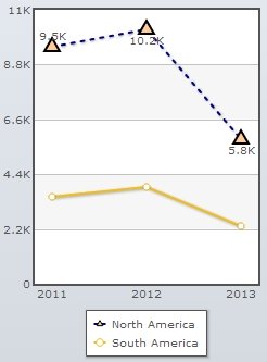
A chart with the above configuration looks as under:
NOTE:
Click Apply to apply the changes made.
Click Revert to undo the changes.
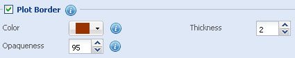
Customize plot border properties
Collabion Charts for SharePoint allows you to customize the border of the dataplots that represent a particular set of data. Dataplots are the visual representation of the chart data.
The dataplot border features are applicable to the following charts:
- Bubble charts
- Multi-series Area 2D charts
- Multi-series Spline Area charts
- Inverse Area charts
- Stacked Area 2D charts
- 2D Single Y Combination charts
- 2D Dual Y Combination charts
- Scroll Area 2D charts
- Scroll Combination 2D (Single Y) charts
- Scroll Combination 2D (Dual Y) charts.
You need to select the Plot Border checkbox to display the plot borders in the chart. Click Preview changes to view the change. By default, the Plot Border check box is selected and the plot borders are displayed on the chart.
Note: The dataplot options are enabled only if the Plot Border checkbox is selected.
Clear the Plot Border check box if you wish not to display the plot borders.
You can customize the plot border properties by changing the following settings:
- Select the background color from the Color drop-down color picker. Choose (Auto) to make the chart automatically decide the color.
- Set the opaqueness of the data plot by selecting or entering a value between 0-100 in the Opaqueness box.
- Select or enter the border thickness in the Thickness box.
- Click Preview to view the changes.
A chart with the above configurations looks as under:
NOTE:
Click Apply to apply the changes made.
Click Revert to undo the changes.
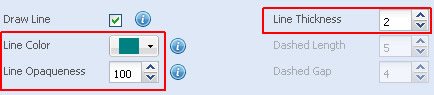
In scatter charts, you can join the dataplots using a line. Select the Draw Line checkbox to join the dataplots with a line. Click Preview to view the change.
You can customize the line properties by changing the following settings:
- Select the line color from the Line Color drop-down color picker. Choose (Auto) to make the chart automatically decide the color.
- Set the opaqueness of the line by selecting or entering a value between 0-100 in the Line Opaqueness box.
- The lowest value 0 will make the grid lines completely transparent and invisible; and the highest value 100 will make them completely opaque. Select or enter a value between 0-100 in the Line Opaqueness box.
- The value 100 makes the line completely opaque, whereas, the value 0 makes it completely transparent.
- Select or enter the thickness of the line in the Line Thickness box.
- Click Preview to view the changes.
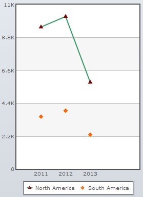
A chart with the above configurations looks as under:
NOTE:
Click Apply to apply the changes made.
Click Revert to undo the changes.
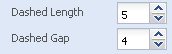
Customize dashed lines
You can display the lines that join the dataplots as dashed or broken lines by selecting the Show as Dashed checkbox above.
You can specify the length of each dash and determine the space between each dash by changing the following features:
- In the Dashed Length box, select or enter the length of each dash (in pixels).
- In the Dashed Gap box, select or enter the space between each dash (in pixels).
- Click Preview to view the changes.
A chart with the above configurations looks as under:
NOTE:
Click Apply to apply the changes made.
Click Revert to undo the changes.