Collabion Charts for SharePoint provides various options for customizing the display of numbers on charts. You can add a prefix or suffix to the numbers, configure decimal places, assign units and scale the numbers based on a pre-defined scale.
Learn how to configure the secondary axis in the dual Y-Axis charts, from the sections below:
- Specify number prefix and suffix
- Format numbers
- Scale units for the chart
- Configure decimal places
- Configure Secondary Axis for Pareto Charts
Specify number prefix and suffix
You can add a prefix or a suffix to all numbers. You can denote a single character or a set of characters as the prefix or the suffix, for all the numeric values on the chart.
- Specify the desired character or characters in the Prefix to be added before each number text box. Prefix can be used to show a currency symbol. For example, if you provide "$", the $ character is added before the numbers.
- A chart displaying “$” as prefix is shown below:
- Specify the desired character or characters in the Suffix to be added after each number text box. Suffix can be used to show units of the numbers. For example, if you provide "%",the % sign gets added after the numbers.
- Click Preview to view the changes made.
![]()
Note:
Click Apply to apply the changes.
Click Revert to undo the changes made.
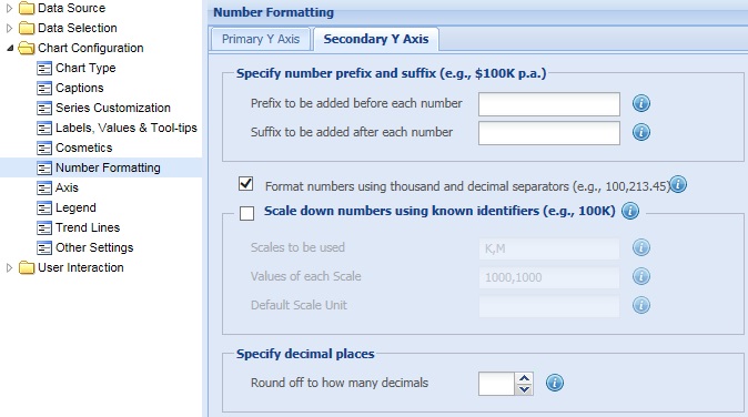
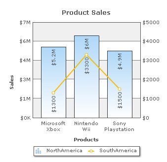
To customize the format of numbers for the secondary Y-Axis values, select the Format numbers using thousand and decimal separators (e.g., 100,213.45) check box and click Preview changes to view the change made.
Note: This setting takes the format that has been set for the numbers of the primary Y-Axis.
![]()
A chart with the above setting looks as under:
To disable the setting clear the Format numbers using thousand and decimal separators (e.g., 100,213.45) check box and click Preview to view the change.
![]()
Note:
Click Apply to apply the change.
Click Revert to undo the change made.
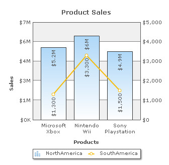
You can shorten the numbers on charts as per a specific scale. You can define your own scales that will be applied to all numbers on the chart.
Let's start with the most basic example- thousands (K) and millions (M) scale. Collabion Charts for SharePoint, by default, has 1000,1000 (K,M) scaling defined for all charts. This means that if your numbers on the chart are greater than 1000, Collabion Charts for SharePoint scales them to K (Thousands) or M (Millions). However, it doesn't have the scaling for billions defined. Let's modify the number scaling to add billion so that the final scale looks like 1000,1000,1000 (K,M,B).
This scale, in human terms, would look something as under:
1000 = 1 K
1000 K = 1 M
1000 M = 1 B
The chart below demonstrates the default scaling:
To define your own scales follow the steps below:
- Select the Scale down numbers using known identifiers checkbox to enable scaling of numbers on the chart.
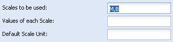
- Specify the units for the numbers to be scaled in the Scales to be used text box. You need to specify the hierarchy in ascending order. After scaling a number, the respective unit is used as a suffix to the scaled number. Multiple units are separated by comma (,).
- For example, enter “M,B” in the Scales to be used text box.
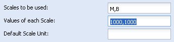
- Provide the list of numbers (separated by comma) that are to be used to scale a numerical value on the chart, in the Values of each Scale text box. You need to specify the conversion quantities in the same hierarchy as the units for scaling numbers have been set in the Scales to be used text box.
- For example, enter “1000,1000” in the Values of each Scale text box.
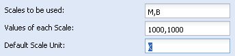
- Specify the unit for the numbers that are not scaled, in the Default scale unit text box. The smallest unit in the hierarchical order is usually determined as the default unit. This unit is used as suffix to the numbers.
- For example, enter “K” in the Default scale unit text box.
- Click Preview to view the changes.
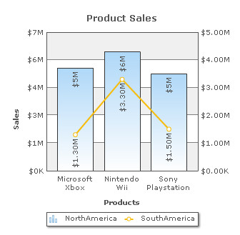
The following chart demonstrates the Scale down numbers using known identifiers feature for the secondary Y-Axis:
Note:
Click Apply to apply the changes.
Click Revert to undo the changes made.
You can specify the maximum number of decimal places for the secondary Y-Axis values and the data values corresponding to the secondary Y-Axis. Select or enter a value in the Round off to how many decimals box to set the number of decimal places for the secondary Y-Axis values and the data values corresponding to the secondary Y-Axis. Click Preview to view the change.
In order to have a fixed number of decimal places attached to the secondary Y-Axis values, you must select the Force Y Axis decimal values check box present in the Primary Y-Axis section. Similarly, to have a fixed number of decimal places attached to the data values corresponding to the secondary Y-Axis, you must select the Force exact number of decimals check box present in the Primary Y-Axis section.
For example, if you set the Round off to how many decimals to 2, a number like 55.345 will be rounded to 55.34. This does not mean that all numbers will be displayed with a fixed number of decimal places. For instance 55 will not be displayed as 55.00 and 55.1 will not become 55.10.
Note: To round off and display the fractional part of a number, make sure that you have selected the Format numbers using thousand and decimal separators (e.g., 100,213.45) check box.
![]()
A chart with configured decimal places is shown below:
Note:
Click Apply to apply the change.
Click Revert to undo the change made.
Configure Secondary Axis for Pareto Charts
Collabion Charts for SharePoint allows you to configure the secondary Y-Axis of Pareto Charts in various ways.
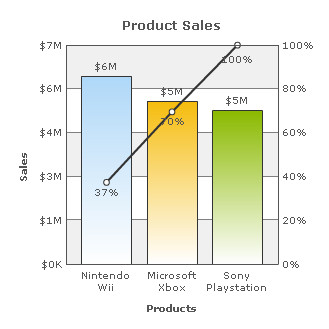
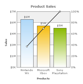
Note: The primary axis shows frequency of occurrence, but it can alternatively represent cost or another important unit of measure. The secondary axis shows the cumulative percentage of the total number of occurrences, total cost, or total of the particular unit of measure.
A default Pareto Chart looks as under:
Learn how to:
- Show or hide Secondary Axis Limits
- Show or hide Secondary Axis Values
- Show or hide Cumulative Line
- Show or hide Line values
- Set Secondary Axis Name width
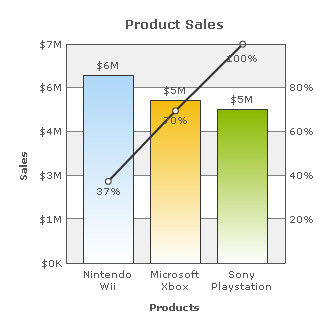
Show or hide Secondary Axis Limits
By default, the values for the upper and lower limits of the secondary Y-Axis are displayed. To hide them, clear the Show Secondary Axis Limits check box and click Preview to view the change.
![]()
The chart without the secondary axis limits looks as under:
Note:
Click Apply to apply the change.
Click Revert to undo the change made.
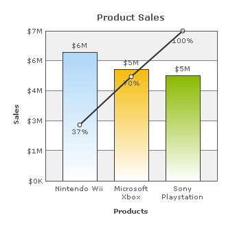
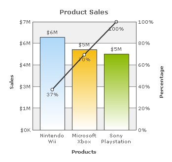
Show or hide Secondary Axis Values
By default, the values of the secondary Y-Axis are displayed. To hide the values, clear the Show Secondary Axis Values check box and click Preview to view the change.
![]()
A chart without the secondary axis values is shown below:
Note:
Click Apply to apply the change.
Click Revert to undo the change made.
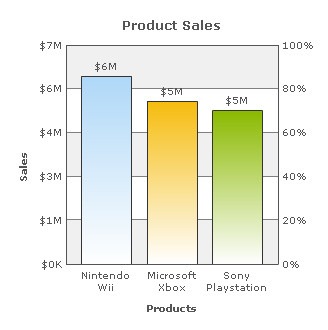
The data for Pareto Chart is single series. The percent values for line is automatically calculated and added to the chart. If you do not wish to show the line dataset clear the Show Cumulative Line check box and click Preview to view the change.
![]()
A chart without the cumulative line is shown below:
Note:
Click Apply to apply the change.
Click Revert to undo the change made.
To hide the values associated with the cumulative line attached with the secondary Y-Axis, clear the Show Line values check box and click Preview to view the change. By default this check box is enabled.
Note: This feature is deactivated if the Show Cumulative Line check box is cleared.
![]()
A chart without the cumulative line values looks as under:
Note:
Click Apply to apply the change.
Click Revert to undo the change made.
Setting Secondary Axis Name width
To set the distance between the secondary Y-Axis title and the chart canvas, enter a value (in pixels) in the Secondary Axis Name Width box and click Preview to view the change. The default width is 0.
![]()
A chart with Secondary Axis Name Width set to 40 will look like as under:
Note:
Click Apply to apply the change.
Click Revert to undo the change made.