A pie chart is a circular chart in which the circle is divided into various sectors or slices. Each slice represents a percentage or fraction of the total dataset. A doughnut chart is functionally similar to a pie chart, with the exception of a blank center. Pie and doughnut charts are useful in comparing different fragments of a total amount. They can be used for showing data composition and are often used to present financial information.
Learn how to:
- Customize the common visual aspects of Pie and Doughnut charts
- Set the bevel distance
- Customize the 3D properties
Customize the common visual aspects of Pie and Doughnut charts
To customize the visual appearance of a Pie or Doughnut chart you can:
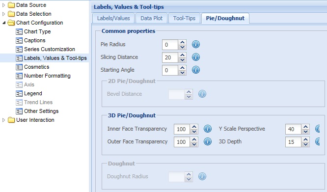
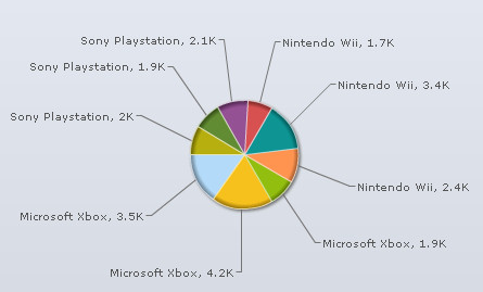
- Select or enter a value in the Pie Radius value box to set the radius of the pie chart.
- Select or enter a value in the Slicing Distance value box to set the distance of the pie slices from the center of the chart.
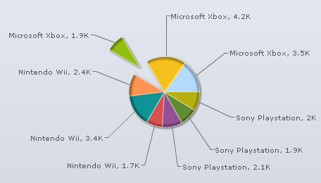
- Select or enter a value in the Starting Angle value box to set the starting angle of the chart.
By default, a pie or doughnut chart starts from angle 0 degree, that is, the first pie slice starts plotting from 0 degree angle. It obeys the conventions of co-ordinate geometry where 0 degrees means hand of a clock at 3. the starting angle increases anti-clockwise. - Click Preview to view the changes.
![]()
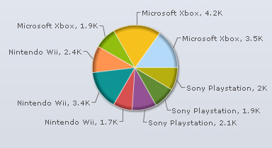
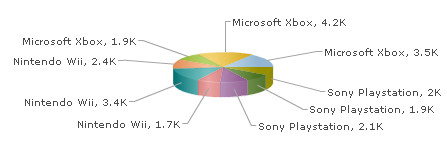
A chart with the above setting is shown below:
![]()
A chart with the above setting is shown below:
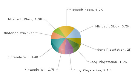
![]()
A chart with the above setting is shown below:
Note:
Click Apply to apply the changes made.
Click Revert to undo the changes.
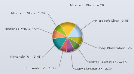
Select or enter a value in the Bevel Distance value box to set the bevel height of the pie or doughnut chart. Click Preview to view the change.
![]()
Note:
Click Apply to apply the changes made.
Click Revert to undo the changes.
To customize the visual appearance of a 3D Pie or Doughnut chart you can:
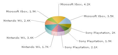
- Select or enter a value in the Inner Face Transparency value box to set the transparency of the inner edges of the chart.
- Select or enter a value in the Outer Face Transparencyvalue box to set the transparency of the outer edges of the chart.
- Select or enter a value in the Y Scale Perspective value box to set the 3D perspective of the chart or the angle from which the chart is viewed.
The range of this setting is between 30 to 80. This attribute alters the y-perspective of the pie in percentage figures. 80 means the full pie face is visible and 30 means only the side face is visible. This setting is applicable only in 3D view. - Select or enter a value in the 3D Depth value box to set the height of the 3D chart.
- Click Preview to view the changes.
![]()
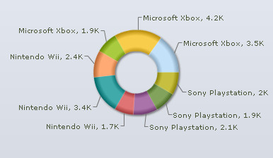
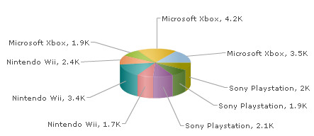
The chart with the above setting looks like:
![]()
![]()
The chart with the above setting looks like:
![]()
![]()
![]()
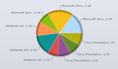
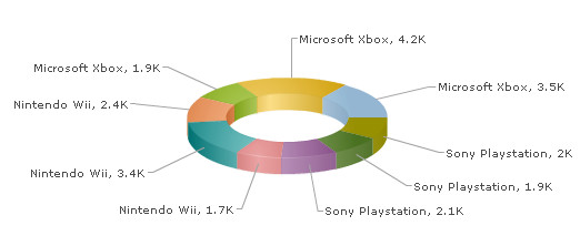
The chart with the above setting looks like:
Note:
Click Apply to apply the changes made.
Click Revert to undo the changes.
Set the inner radius of a Doughnut chart
Select or enter a value in the Doughnut Radius box to explicityly set the inner radius of the chart. Click Preview to view the change.
The chart automatically calculates the best fit radius. The inner radius cannot be more than the outer radius.
![]()
The chart with the above setting looks like:
Note:
Click Apply to apply the changes made.
Click Revert to undo the changes.