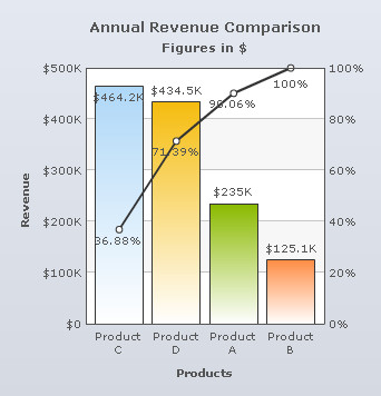
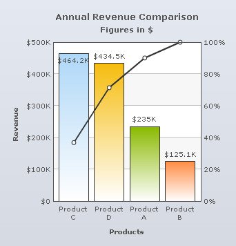
Pareto chart illustrates the Pareto principle, according to which 20% of causes are responsible for 80% of effects. It contains both columns and line. Columns represent the data values and the upward curving line displays the cumulative total of these values. There are two Y-Axes; the left Y-Axis represents the scale for the data values and the right Y-Axis shows the scale for the cumulative percentage of the data values.
Learn how to:
- Set the position of the cumulative values on the line
- Show or hide the cumulative line
- Show or hide the percent values of the cumulative line
Set the position of the cumulative values on the line
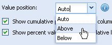
To set the position of the cumulative values, select an option from the Value position drop-down list and click Preview to view the change. The values can be placed Below or Above the marker points or anchors of the cumulative line.
Select Auto to let the chart decided the position automatically.
A Pareto Chart displaying the cumulative values above the cumulative line looks as under:
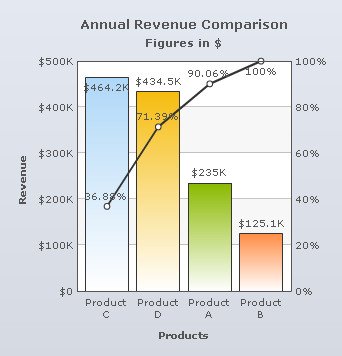
A Pareto Chart displaying the cumulative values below the cumulative line looks as under:
Note:
Click Apply to apply the change made.
Click Revert to undo the change.
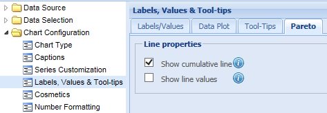
Show or hide the cumulative line
Select the Show cumulative line check box to display the cumulative line. By default, this setting is turned on and the cumulative line is displayed. Click Preview to view the change.
![]()
To hide the cumulative line, clear the Show cumulative line check box and click Preview to view the change.
![]()
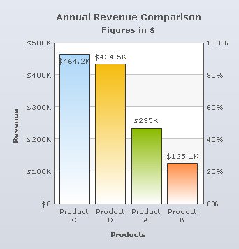
A Pareto Chart without the cumulative line looks as under:
Note:
Click Apply to apply the change made.
Click Revert to undo the change.
Show or hide the percent values of the cumulative line
Select the Show line values check box to display the cumulative line values. By default, this setting is turned on and the values are displayed. Click Preview to view the change.
![]()
To hide the cumulative line values, clear the Show line values check box and click Preview to view the change.
![]()
A chart without the cumulative values is shown below:
Note:
Click Apply to apply the change made.
Click Revert to undo the change.