Collabion Charts for SharePoint provides some special charts that have very interesting implications. This section introduces to these special charts.
Funnel Chart
The Funnel chart helps in showing the outcome of a process that involves reduction or elimination at each progressive level. The recruitment process is an ideal example of such a process as it involves elimination at each progressive level.

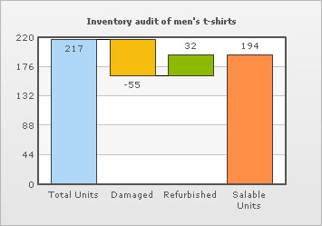
Waterfall Chart
A Waterfall chart lets you show how a value increases or decreases to come to a final value. The Waterfall chart can be used in a variety of ways. For instance, it can be used for showing income and expenditure, change in inventory levels, etc.
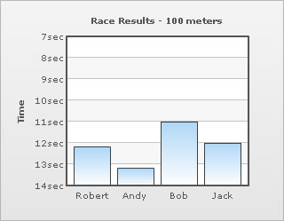
Inverse Axis Chart
Inverse Y-Axis charts are specialized forms of conventional Column, Line and Area charts that plot data on an inverted scale (descending order). They are used for showing ranking order, race timings, etc.
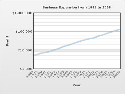
Logarithmic Charts
Logarithmic charts are specialized forms of Column and Line charts that plot data on a logarithmic scale. These charts are perfect for plotting data that comprises of both small and large values.
Pareto Charts
Pareto charts are Single series charts in which data values are plotted in descending order of their magnitude. The data values are plotted as columns and their cumulative sum - in percentage form, is plotted as a line against the secondary Y-axis.

Pareto chart illustrates the Pareto principle according to which 20% of causes are responsible for 80% of effects. Ideally, Pareto charts are used for isolating the key causes of a problem. However, they can also be used for determining the key factors of success.
The auto-generated cumulative line helps in isolating large data values from the small ones. The line is present by default, but can be removed if so desired.
Marimekko Chart
Marimekko charts are used for marketing analysis. They help in visualizing the size of each market segment together with the share of individual competitors in each of the segments.
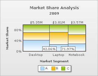
The Marimekko chart automatically computes the size of each market segments and the percentage share held by the competitors in each of the segments. The data can be provided in terms of sales or quantity.
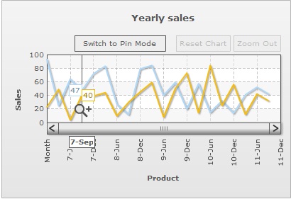
Zoom Line Chart
The Zoom Line chart is a special type of Multi-series Line chart that allows analysis of data at both macroscopic and microscopic level. It is meant for plotting large quantities of data, which if plotted on an ordinary line chart would produce almost unreadable results. The zoom line chart can easily plot tens of thousands of data points within a single chart.
At the time of rendering, the zoom-line chart displays a macroscopic view of the data. The data is precisely compressed, so the entire dataset fits within the chart. When the user selects a segment of the line plot by dragging the mouse cursor across the canvas, the selected portion expands to occupy the entire width of the chart. At this point, the scroll-bar becomes functional, allowing the user to view the data that precedes or follows the selected section of data. This gives a better visualization and understanding of the dataset. To analyze the data more comprehensively, the user can repeat the select and zoom process several times until the point where further zooming is not possible. The chart can be restored to its original macroscopic display mode by clicking the Reset Chart button on the toolbar or by selecting Reset Chart from the right-click menu.