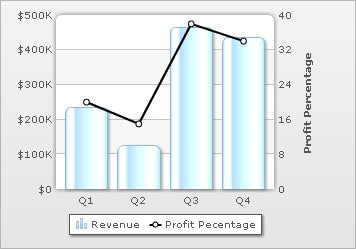
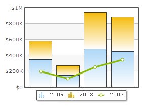
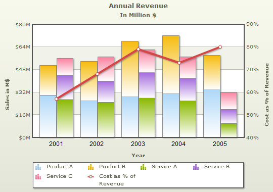
Combination charts are also Multi series charts which allow you to plot each series in a different way. Using these charts, you can combine two or more types of charts. You can combine a Line chart with a Column chart or combine Line, Area and Column charts in a single chart. Combination charts are used when the data series that are being plotted, are of dissimilar nature. Some Combination charts allow you to combine charts of two different scales. We call these charts - Dual Y-Axis charts. For example, if you wish to compare revenue amount and profit percentage, then using a conventional Multi series chart will not help your audience in distinguishing between the two series. However, if you plot revenue as columns and profit percentage as a line on a dual axis Combination chart, then your audience will easily grasp the data. The image below will illustrate the proposition in details.
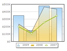
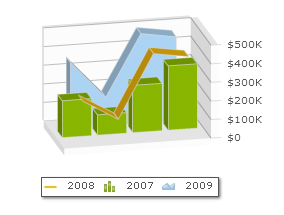
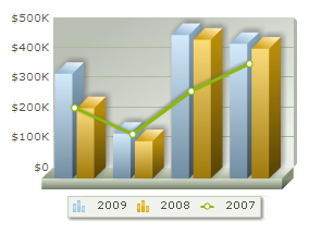
Collabion Charts for SharePoint provides 9 types of combination charts, which includes charts with single and dual Y-Axis charts and an interactive true 3D chart.
 |
 |
| 2D Single Y Combination | 3D Single Y Combination |
 |
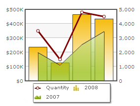 |
| Column 3D + Line Single Y | 2D Dual Y Combination |
 |
 |
| Column 3D + Line Dual Y | Stacked Column 3D + Line Dual Y |
 |
 |
| 3D Stacked Column Line (Single Y axis) | 2D Stacked Column Line (Single Y axis) |
 |
|
| Multi-series Stacked Column 2D + Line Dual Y | |