The smart labels and lines setting prevents overlapping of long data labels in Pie, Doughnut, Funnel, and Pyramid charts.
Learn how to:
- Use smart labelling
- Configure label distance from the edge of the dataplots
- Force to display all the labels
- Set clearance distance of a label
- Configure the smart lines
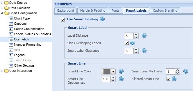
To use smart labels and lines, select the Use Smart Labeling check box and click Preview to view the changes. By default, this setting is enabled.
![]()
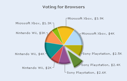
A pie chart with smart lines looks as under:
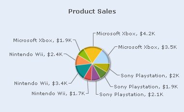
To disable smart labels and lines, clear the Use Smart Labeling check box and click Preview to view the changes.
![]()
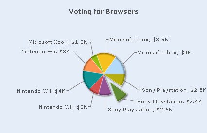
A pie chart without smart lines looks as under:
Note:
Click Apply to apply the change made.
Click Revert to undo the change.
Configure labels distance from the edge of the dataplots
This setting helps you set the distance of the label or the value text boxes from the chart edge. This setting is applicable only when smart labeling is disabled.
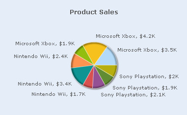
Select or enter a value in the Label Distance box to set the distance and click Preview to view the change.
![]()
A pie chart with customized smart label distance looks as under:
Note:
Click Apply to apply the change made.
Click Revert to undo the change.
Force to display all the labels
When the smart labels setting is enabled, the chart skips and does not display some of the data labels to prevent overlapping. This scenario occurs when there are too many long data labels present. This setting is available only in Pie and Doughnut charts.
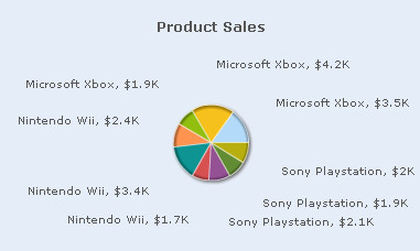
You can opt to show all the data labels by clearing the Skip Overlapping Labels check box. This allows the chart to display all the data labels irrespective of their length and the overlapping situation. Click Preview to view the change made.
![]()
The chart below shows overlapping data labels when the Skip Overlapping Labels feature is disabled.
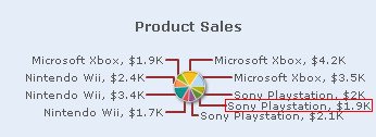
To hide the overlapping data labels so that that the chart does not look cluttered, you need to select the Skip Overlapping Labels check box. Click Preview to view the change made.
![]()
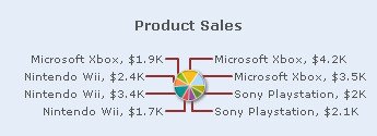
The chart below hides the data label marked in the chart above. Here, the Skip Overlapping Labels feature is enabled.
Note:
Click Apply to apply the change made.
Click Revert to undo the change.
Set clearance distance of a label
In case of too many long data labels, you can set the distance between the data labels of sliced-out dataplots and the adjacent sliced-in dataplots. Specify the intended value in the Smart Label Clearance box and click Preview to view the change.
For example, let us set Smart Label Clearance to “-20”.
![]()
A pie chart with Smart Label Clearance set to “-20” looks as under:
Let us take another example. We have set Smart Label Clearance to “20”.
![]()
The chart below demonstrates Smart Label Clearance set to “20”.
Note:
Click Apply to apply the changes made.
Click Revert to undo the changes.
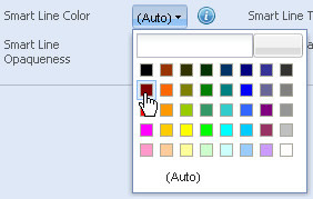
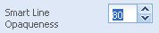
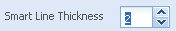
To configure the smart lines you can:
- Choose a color for the smart lines from the Smart Line Color drop-down color picker. Select (Auto) to let the chart automatically decide the color.
- Select or enter a value between 0-100 in the Smart Line Opaqueness box to set the transparency of the smart lines.
This value represents the percentage of transparency. The value 100 makes the smart lines completely opaque, whereas, the value 0 makes the smart lines completely transparent.
- Select or enter a value in the Smart Line Thickness box to set the thickness of the smart lines.
- Select the Slanted Smart Line check box to display slanted smart lines.
By default, this feature is enabled and the smart lines are displayed as slanted. To display straight smart lines, clear the Slanted Smart Line check box.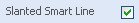
- Click Preview changes to view the changes.
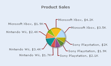
A pie chart with the above configurations looks as under:
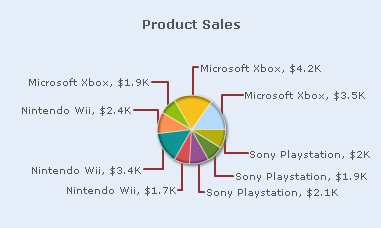
The pie chart below demonstrates the above configurations but with straight smart lines.
Note:
Click Apply to apply the changes made.
Click Revert to undo the changes.