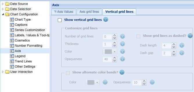
Collabion Charts for SharePoint allows you to add vertical grid lines to Line, Area, Spline, Zoom Line and Radar charts. These lines help you separate blocks of data. They can be placed between any two data points, even at irregular intervals. Vertical grid lines are not displayed by default.
Learn how to:
- Add vertical grid lines to the chart
- Customize the vertical grid lines
- Display alternatively colored vertical bands on a chart
Add vertical grid lines to the chart
You need to follow the process to show vertical grid lines:
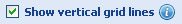
- Select the Show vertical grid lines check box
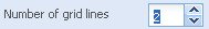
- Select or enter the intended number of vertical grid lines in the Number of grid lines box.
- Click Preview to view the change.
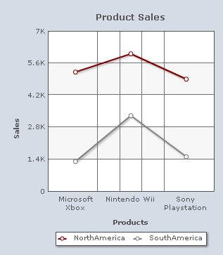
A Line chart with two vertical grid lines looks as under:

Note:
Click Apply to apply the change.
Click Revert to undo the change made.
Customize the vertical grid lines
You can customize the vertical grid lines as per your requirement.
Learn more about:
- Changing the number of vertical grid lines
- Customizing the appearance of vertical grid lines
- Displaying the vertical grid lines as dashed
- Configuring the dashed vertical grid lines
Changing the number of vertical grid lines
You can specify the number of vertical grid lines that you wish to display on a chart. Select or enter the intended number of vertical grid lines in the Number of vertical grid lines box and click Preview to view the change.
![]()
A chart showing customized number of vertical grid lines looks as under:
Note:
Click Apply to apply the change.
Click Revert to undo the change made.
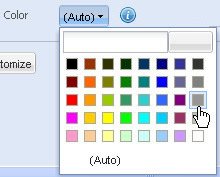
Customizing the appearance of vertical grid lines
To customize the vertical grid lines you need to change the following settings:
- Set the thickness of the vertical grid lines by selecting or entering the appropriate value in the Thickness box.
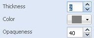
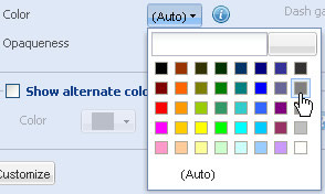
- Choose any color from the Color drop-down color picker to change the color of the vertical grid lines. Select (Auto) to let the chart decide the color automatically.
- Set the opaqueness of the vertical grid lines by selecting or entering a value between 0-100 in the Opaqueness box.
The lowest value 0 will make the vertical grid lines completely transparent and invisible; and the highest value 100 will make them completely opaque.
- Click Preview to view the changes made.
Note:
Click Apply to apply the change.
Click Revert to undo the change made.
Displaying the vertical grid lines as dashed
You can display the vertical grid lines as dashed or broken lines. For this, you need to select the Show grid lines as dashed? check box and click Preview changes to view the change.
![]()
To display the vertical grid lines as continuous lines clear the Show grid lines as dashed? check box. If this check box is cleared, the related fields become deactivated.
![]()
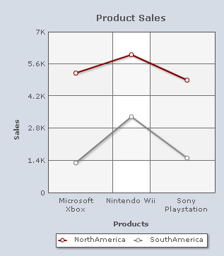
A chart displaying dashed vertical grid lines looks as under:

Configuring the dashed vertical grid lines
To configure the length of each dash and to set the space between each dash you need to:
- Select or enter the length of each dash (in pixels) in the Dash Length box.
- Select or enter the amount of gap (in pixels) between each dash in the Dash Gap Length box.
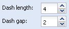
- Click Preview to view the changes.
Note:
Click Apply to apply the change.
Click Revert to undo the change made.
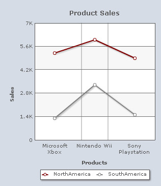
Display alternatively colored vertical bands on a chart
You can enhance the visual appeal of a Line or an Area chart by displaying alternatively colored vertical bands on it. To enable this feature, select the Show alternate color bands check box.
![]()
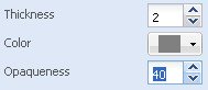
You can customize the colored bands by changing the following settings:
- Choose any color from the Color drop-down color picker to customize the color of the alternate bands. Select (Auto) to let the chart decide the color automatically.
- Set the opaqueness of the colored bands by selecting or entering a value between 0-100 in the Opaqueness box.
The lowest value 0 will make the colored bands completely transparent and invisible; and the highest value 100 will make them completely opaque.

- Click Preview changes to view the changes made.
A chart with the above customizations looks as under:
Note:
Click Apply changes to apply the change.
Click Revert changes to undo the change made.