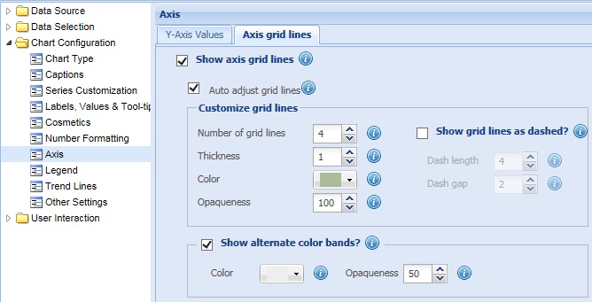
Axis grid Lines are horizontal lines (or vertical lines in bar charts) running through the canvas. They break up the Y-Axis into smaller units helping in better visual data interpretation. These lines highlight the Y-Axis values and help in better data interpretation.
Learn how to:
- Display the axis grid lines
- Automatically adjust the axis grid lines
- Customize the axis grid lines
- Display alternatively colored bands
Axis grid lines are displayed on the chart by default. To hide the axis grid lines, clear the Show axis grid lines check box and click Preview to view the change made. If this check box is cleared, the related fields become deactivated.
![]()
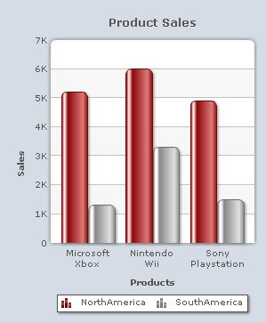
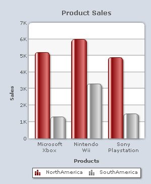
A chart without axis grid lines looks as under:
Note:
Click Apply to apply the change.
Click Revert to undo the change made.
Automatically adjust the axis grid lines
Collabion Charts for SharePoint enables the chart to adjust and automatically calculate the number of grid lines that will be displayed on the chart. To enable automatic configuration of grid lines, you need to select the Auto adjust grid lines check box and click Preview to view the change.
![]()
To disable automatic configuration of grid lines, clear the Auto adjust grid lines check box and click Preview to view the change.
![]()
Note:
Click Apply to apply the change.
Click Revert to undo the change made.
You can customize the axis grid lines as per your requirement.
Learn more about:
- Setting the number of axis grid lines
- Customizing the appearance of axis grid lines
- Displaying the axis grid lines as dashed
- Configuring the dashed grid lines
Setting the number of axis grid lines
To specify the number of grid lines that you want to display on the chart, select or enter the appropriate value in the Number of grid lines box and click Preview to view the change.
Note: To specify the number of grid lines in the chart, make sure that the Auto adjust grid lines check box is cleared. If the Auto adjust grid lines check box is selected, the chart may ignore the value provided in the Number of grid lines box.
![]()
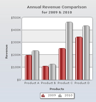
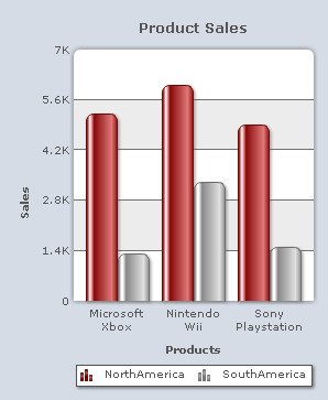
A chart with customized number of grid lines looks as under:
Note:
Click Apply to apply the change.
Click Revert to undo the change made.
Customizing the appearance of axis grid lines
To customize the axis grid lines you need to change the following settings:
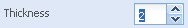
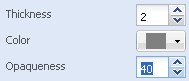
- Set the thickness of the axis grid lines by selecting or entering the appropriate value in the Thickness box.
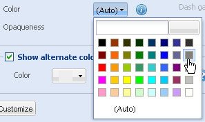
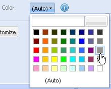
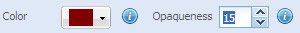
- Choose any color from the Color drop-down color picker to change the color of the grid line. Select (Auto) to let the chart decide the color automatically.
- Set the opaqueness of the axis grid lines by selecting or entering a value between 0-100 in the Opaqueness box.
The lowest value 0 will make the grid lines completely transparent and invisible; and the highest value 100 will make them completely opaque.
- Click Preview to view the changes made.
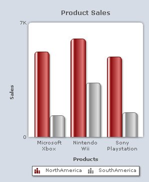
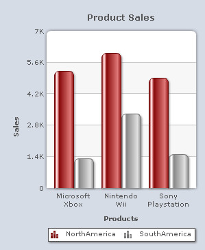
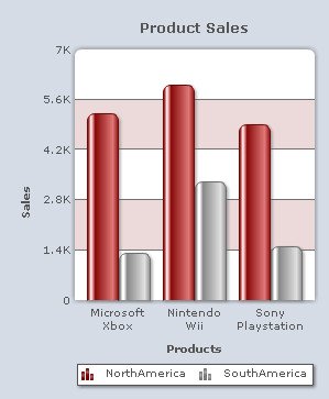
A chart with the above set configurations looks as under:
Note:
Click Apply to apply the changes.
Click Revert to undo the changes made.
Displaying the axis grid lines as dashed
You can display the axis grid lines as dashed or broken lines. For this, you need to select the Show grid lines as dashed? check box and click Preview to view the change.
![]()
To display the grid lines as continuous lines clear the Show grid lines as dashed? check box. If this check box is cleared, the related fields become deactivated.
![]()
Configuring the dashed grid lines
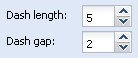
To configure the length of each dash and to set the space between each dash you need to:
- Select or enter the length of each dash (in pixels) in the Dash Length box.
- Select or enter the amount of gap (in pixels) between each dash in the Dash Gap Length box.
- Click Preview to view the changes.
A chart with customized grid lines looks as under:

Note:
Click Apply to apply the changes.
Click Revert to undo the changes made.
Display alternatively colored bands
You can display colored bands alternately between the axis grid lines. This feature is enabled by default.
Note: This feature is not applicable to 3D charts.
![]()
To disable the display of alternate colored bands clear the Show alternate colored bands? check box and click Preview to view the change.
![]()
| A chart showing alternate color bands | A chart without alternate color bands |
 |
 |
You can customize the colored bands by changing the following settings:
- Choose any color from the Color drop-down color picker to customize the color of the alternate bands. Select (Auto) to let the chart decide the color automatically.
- Set the opaqueness of the colored bands by selecting or entering a value between 0-100 in the Opaqueness box.
The lowest value 0 will make the colored bands completely transparent and invisible; and the highest value 100 will make them completely opaque.
- Click Preview to view the changes made.
A chart with the above set configurations looks as under:
Note:
Click Apply changes to apply the changes.
Click Revert changes to undo the changes made.