Drill down is a feature that allows you to create a summarized chart first and then click on the chart’s dataplot (column, bar, points or line, pie/doughnut slices etc.) to open a chart showing detailed data.
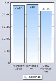
For example, a summarized chart where data is grouped by Product and the series display total earnings for three years. The name of the products appears as the x-axis labels. The sum of total earnings for three years appears as columns.
The chart will look as under:
Now, a drill-down chart can be created which appears when a column is clicked on the summarized chart. The drill-down chart displays the breakdown of total amount sold per year. So, all the three years appears as the x-axis labels of the drill-down chart.
To create drill-down charts, you need to follow the below given steps:
- Select Enabling grouping of data check box.
- Select Product from the drop down list beside On the horizontal axis, group by.
- Select one or more field(s) radio button.
- Select SUM grouping function beside the Earnings series name.
- Click Apply. This completes the Grouping of data and the summarized chart is created.
- Now, select the check box beside Display a drill-down chart when any series is clicked.
- Select Year in the drop down list under On the horizontal axis of the drill-down chart, group data by.
- Select SUM in the drop down list beside with function.
- Select Ascending or Descending in the in order drop down list to set the order in which you want the drill-down chart to display data. If you want to keep the default order select None.
- Click Apply.
- Click Finish to view the chart in a web part.
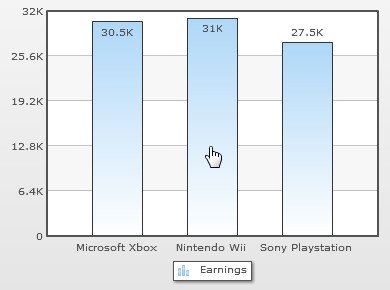
The drill down chart is created and it appears in the web part. Now, click on any of the data plot present on the summarized chart. The sample chart will look as under:
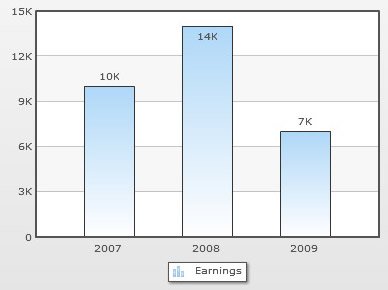
A drill-down chart will appear with the breakup of earnings for each year. The sample chart will look as under:
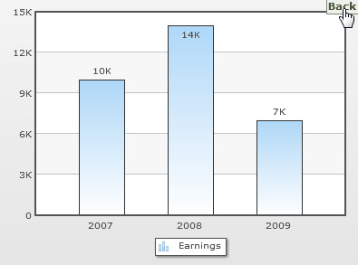
Click Back to view the summarized chart.
Group date based data and enable date based drill down
Let us first consider the case where the grouping is done by date. Consider the data shown in the table below.
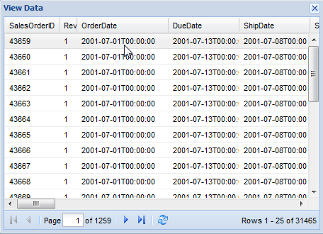
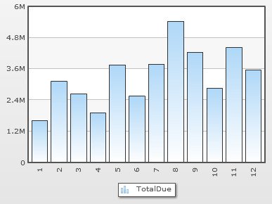
It contains 1259 sales records for four years. The dates are recorded in various date columns. We will only consider the OrderDate column for this example and first summarize the data based on years. Following this, we will configure the chart to show monthly sales figures using drill down settings.
For sales figures, we have selected the TotalDue column (not in the image above).
Steps to achieve this are simple:
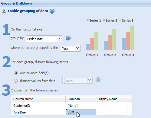
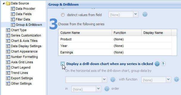
- Open Group & Drilldown wizard page.
- Select Enable grouping of data check box.
- Select OrderDate column from the drop down beside On the horizontal axis, group by .
- Select Year from the drop down beside where dates are grouped by the.
- Select SUM grouping function beside the “TotalDue” column name.
- SUM: Provides the total of all the values under a group.
- AVERAGE: Provides the average of all the values under a group.
- COUNT: Provides the count of all the values under a group.
- MIN: Provides the lowest of all the values under a group.
- MAX: Provides the highest of all the values under a group.
- Click Apply.
The summarized chart will look as under: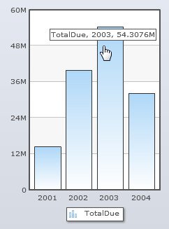
- Now, select Display a drill-down chart when any series is clicked.
- Select Month in the drop down list beside grouped by the field.
- Click Apply.
- Click Finish to view the chart in the web part.
This column should be of Date/Time type.
This setting is enabled only when the Group By column is of Date/Time type. The available options in this setting are:
Year, Quarter, Month, Day, Hour and Minute.
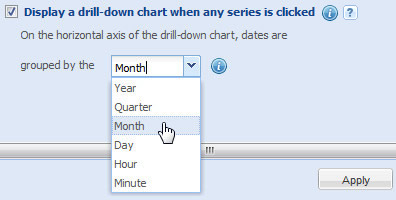
The available options in this setting are: Year, Quarter, Month, Day, Hour and Minute.
Now, click on any of the columns the drill-down chart will appear displaying the total due for 12 months.
The drill-down chart will look as under: